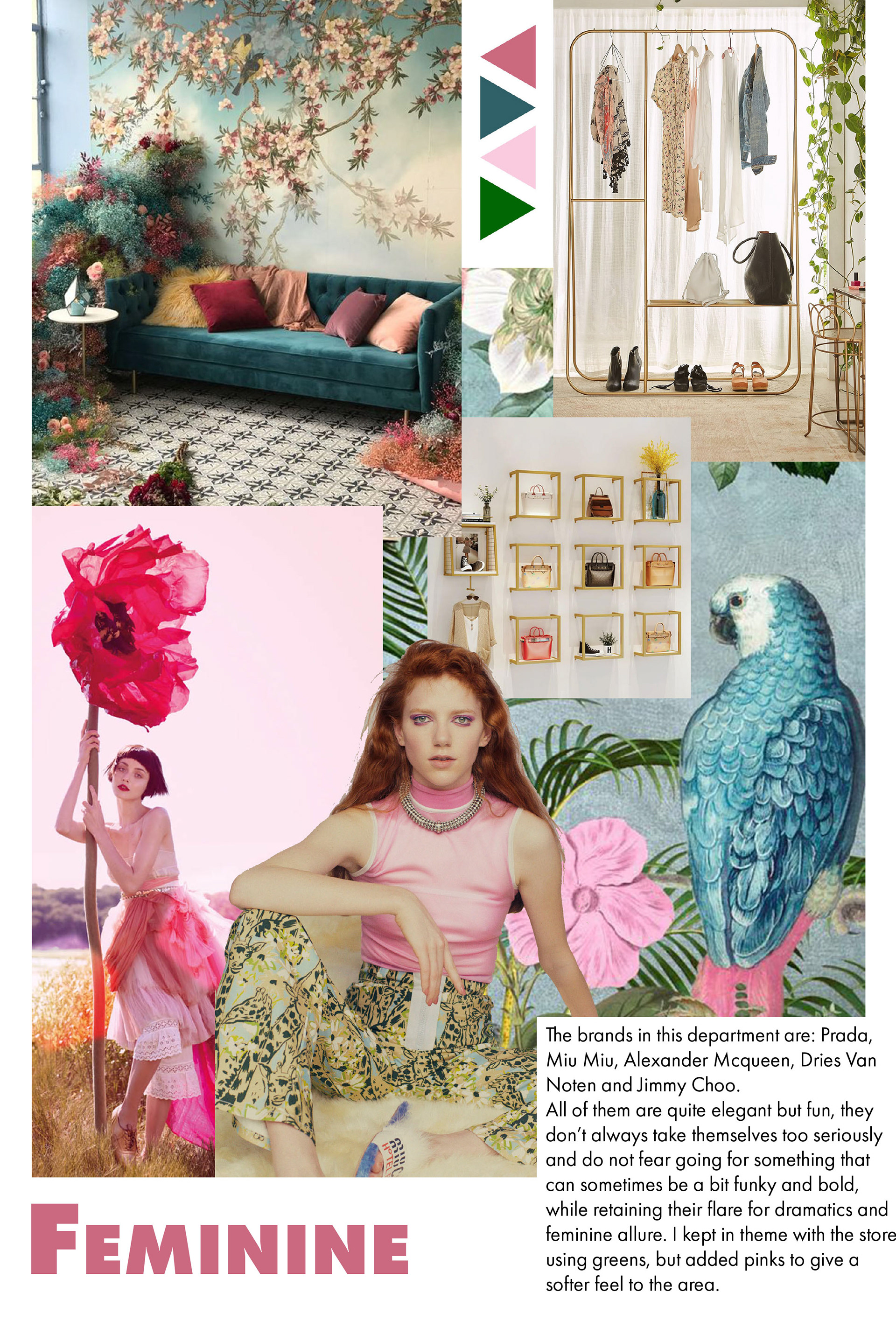
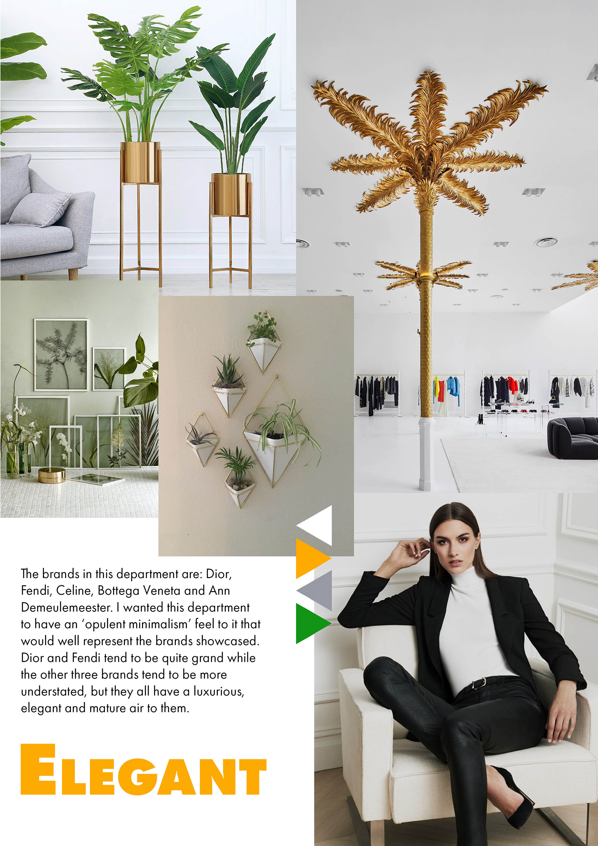
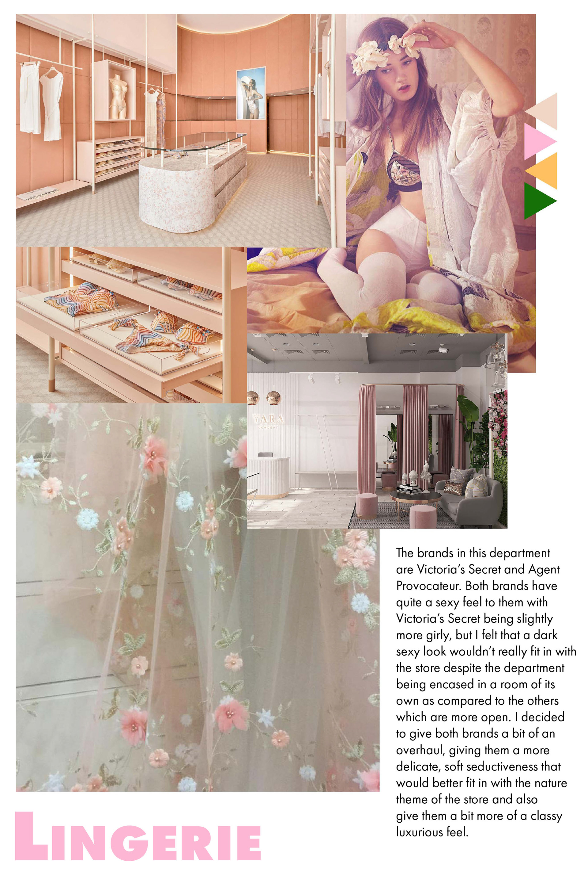
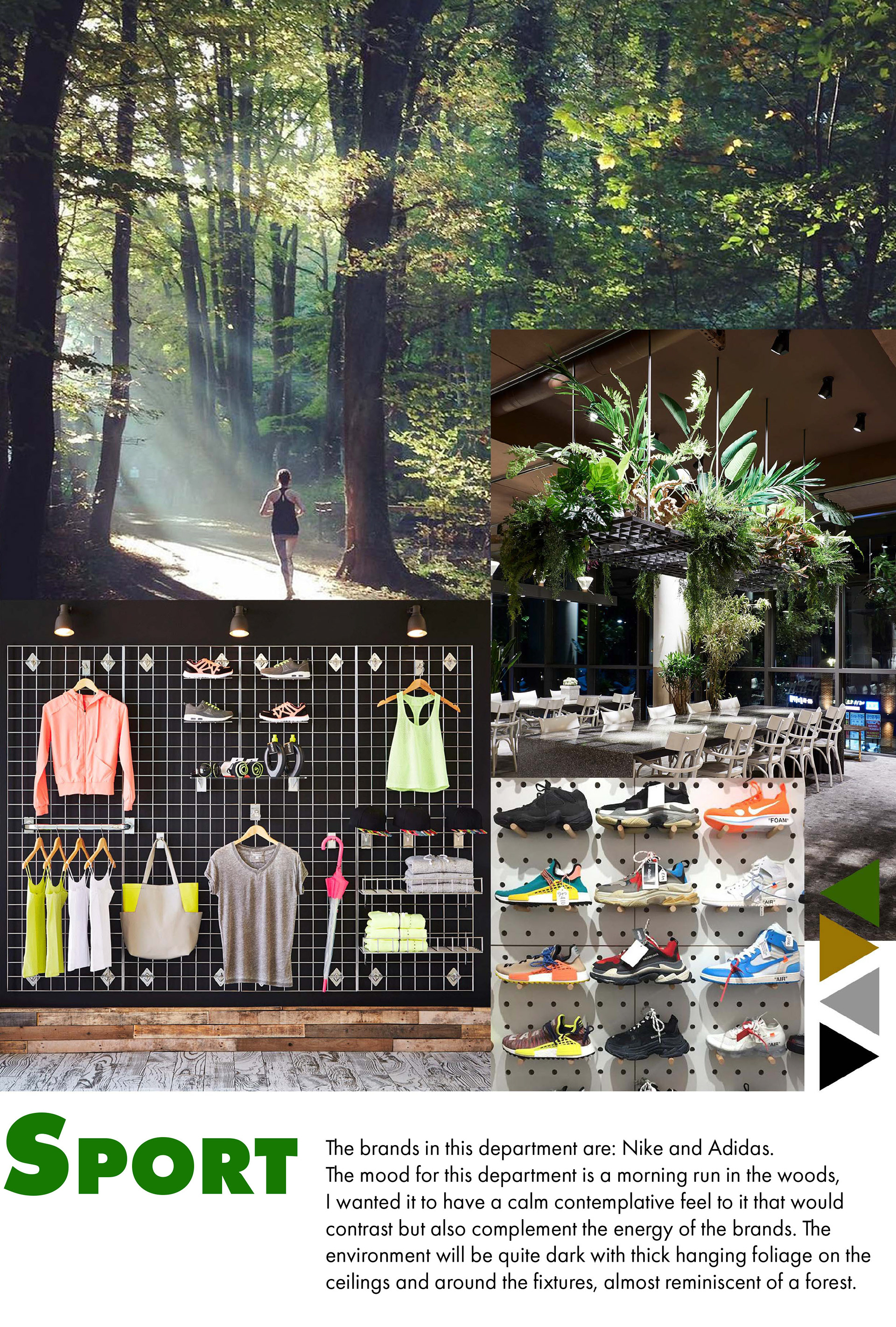
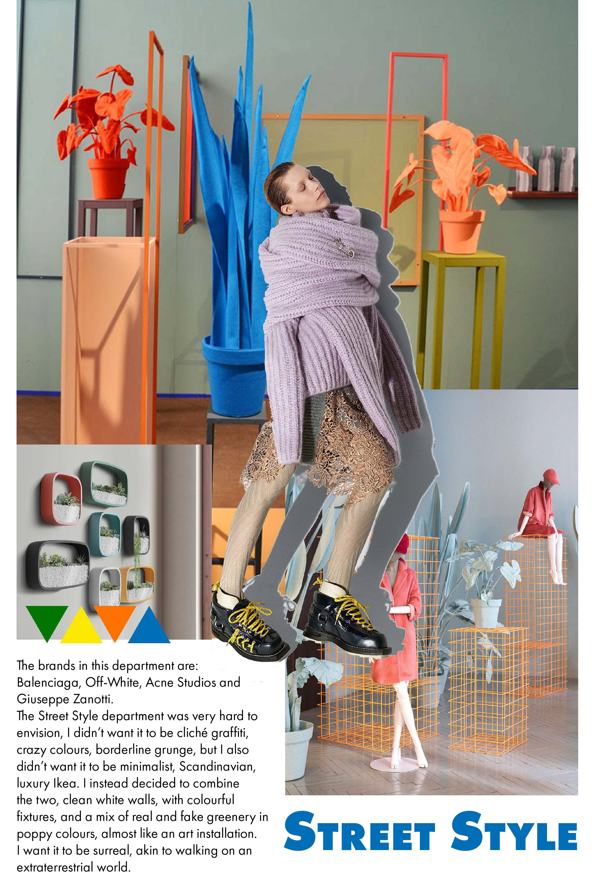
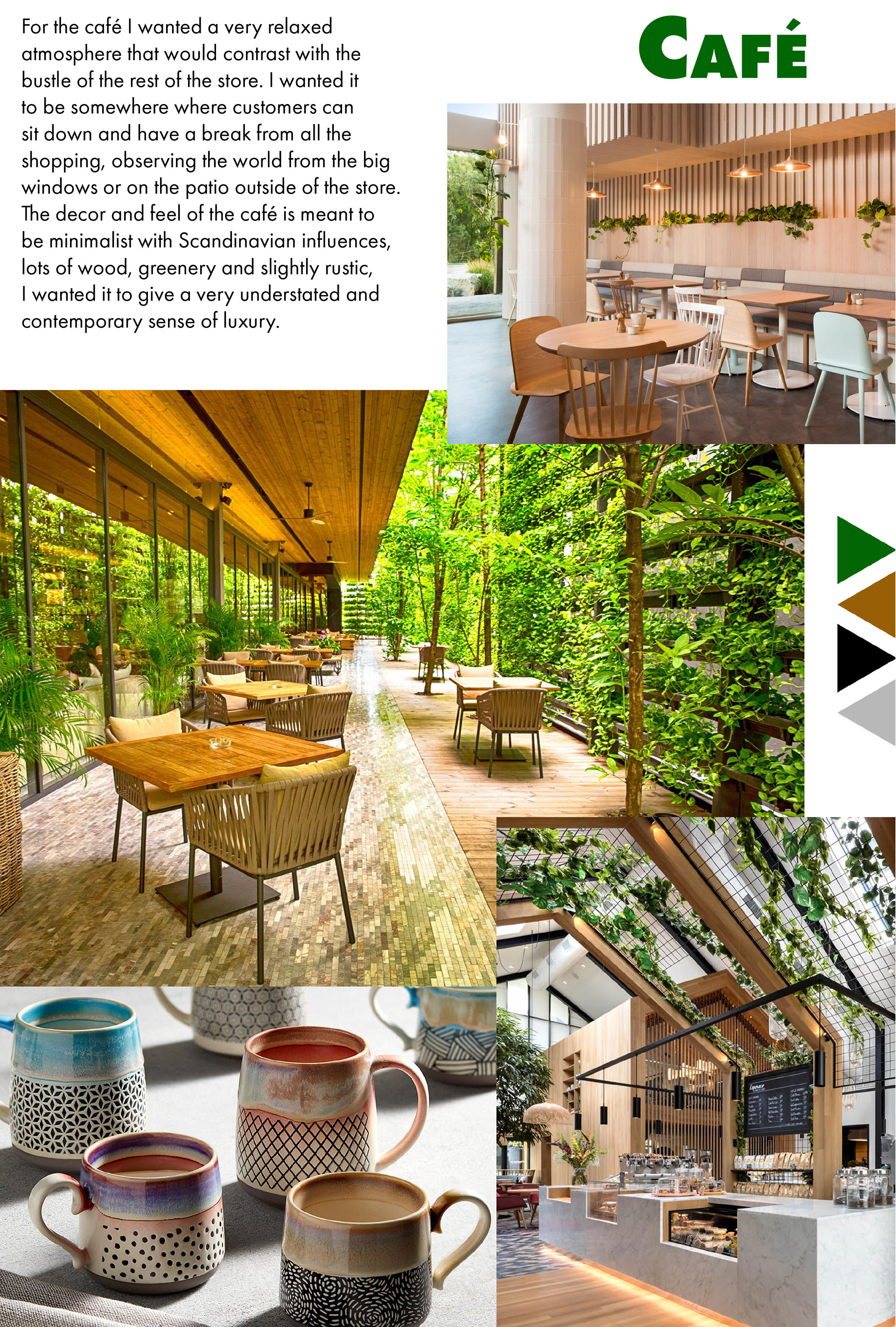
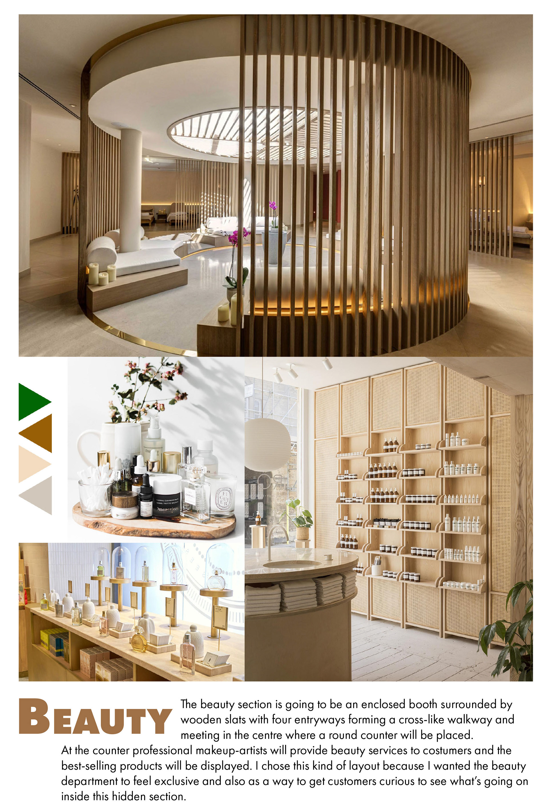
For this individual project I was tasked to create a womenswear department store with a concept of my choosing, from its branding to the overall visual merchandising.
The name of my store is Vivarium, named after the overall concept, through the concept of a vivarium, I wanted to create a department store that is a bit like a greenhouse, bringing the outdoors, indoor and combining it with a contemporary luxurious aesthetic, building a natural habitat for the modern shopper.
Vivarium is not just about shopping, it’s a chance for customers to immerse in nature, relax and let themselves forget about the chaos of everyday life.
Vivarium is not just about shopping, it’s a chance for customers to immerse in nature, relax and let themselves forget about the chaos of everyday life.
Click here for the research behind the project.


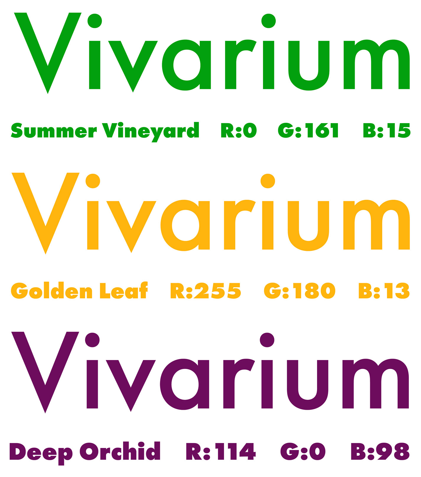
The logo consists of the store’s name with a stylised capital V. Using the V in the name also allowed me to create an icon that can be used to substitute the full logo on platforms such as social media or on small items of merchandise. It’s made up of the dash-like V and two dots borrowed from the I’s in the name, when combined the icon becomes a more legible capital V.

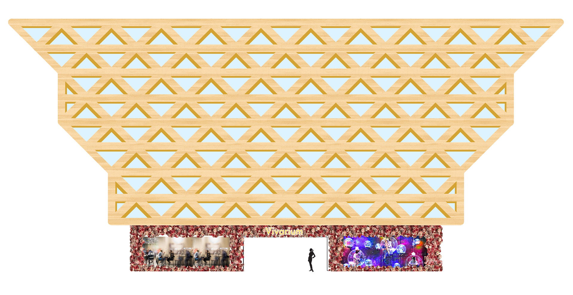
The concept for the building is that of a habitat for nature and humans, I was inspired by greenhouses and biodomes and wanted to apply the idea to fashion.
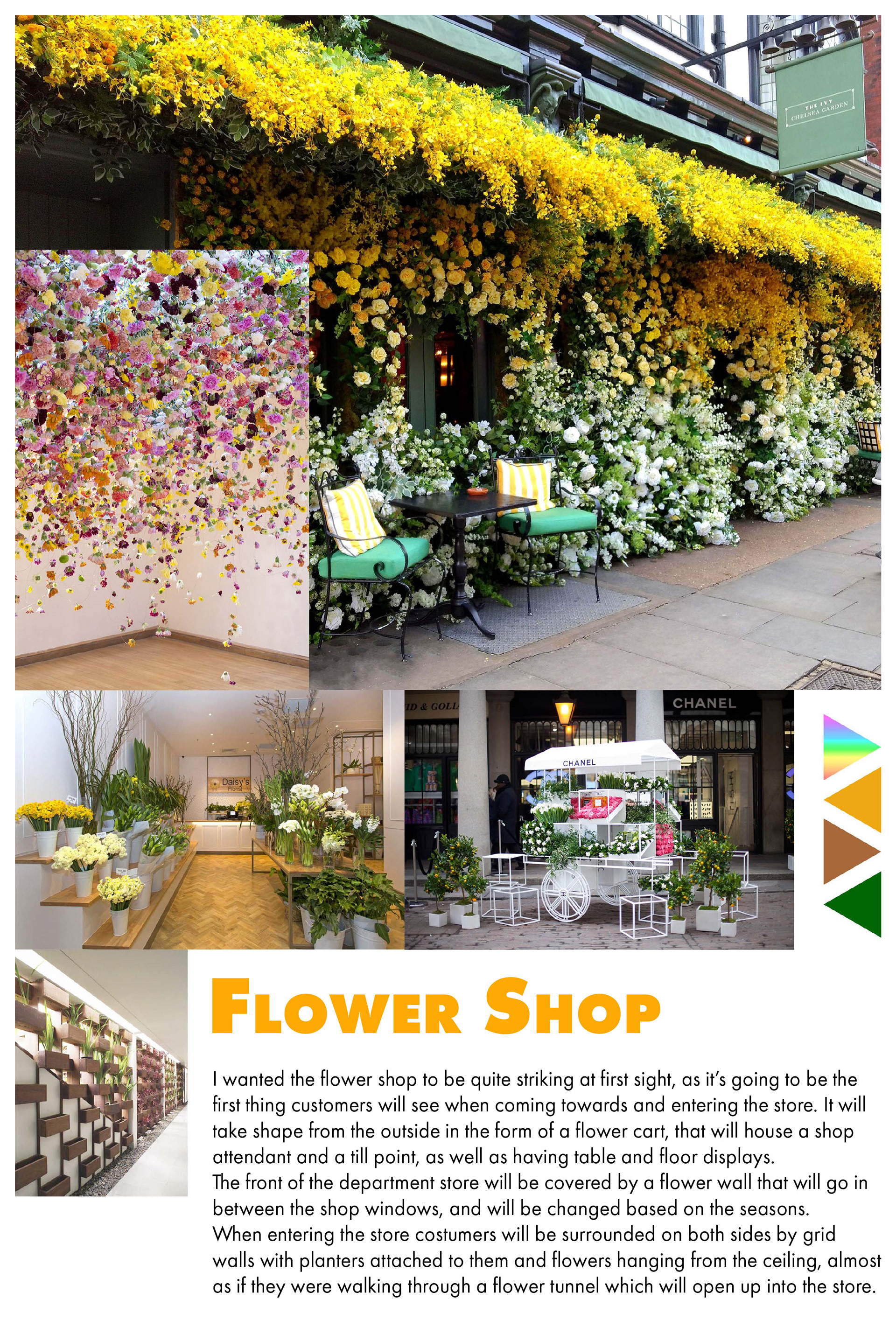
The building is essentially a giant Vivarium made of glass, wood and marble, I want it to be a literal urban jungle, somewhere where people can come not only for shopping but also to escape the city and immerse themselves in nature. The store will come to life from the outside through the outdoor flower shop including a display on the store facade with a side-to-side flower wall, which will be renewed with the changing seasons, surrounding a window looking into the café on the left and a store display on the right.
The building is essentially a giant Vivarium made of glass, wood and marble, I want it to be a literal urban jungle, somewhere where people can come not only for shopping but also to escape the city and immerse themselves in nature. The store will come to life from the outside through the outdoor flower shop including a display on the store facade with a side-to-side flower wall, which will be renewed with the changing seasons, surrounding a window looking into the café on the left and a store display on the right.
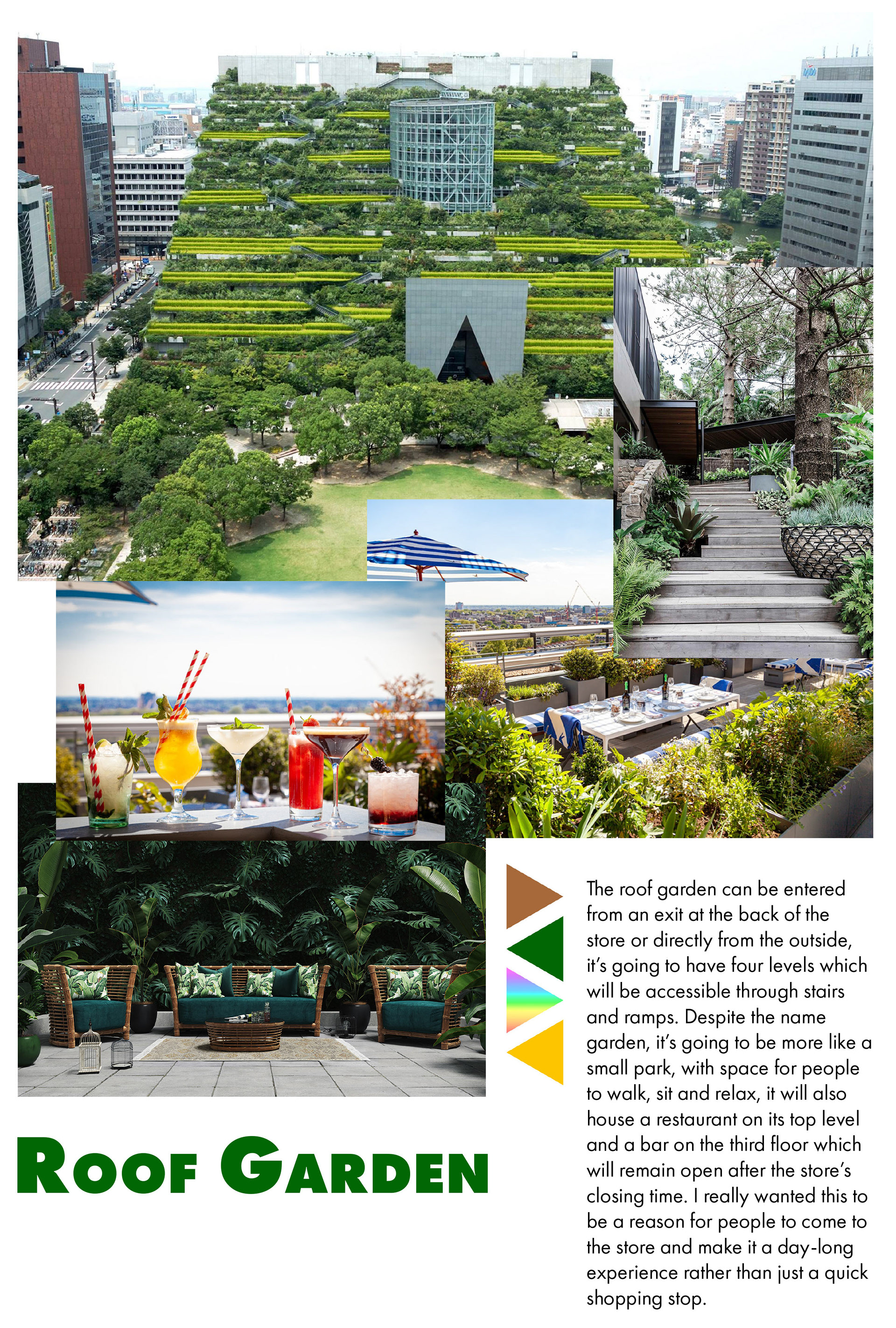
At the back of the store, customers will have access to the four-tiered roof garden through a network of stairs and ramps; the roof garden will be designed with a park-like setup, with space for people to walk, sit and relax, it will also house a restaurant on its top level and a bar on the third floor which will remain open after the store’s closing time.
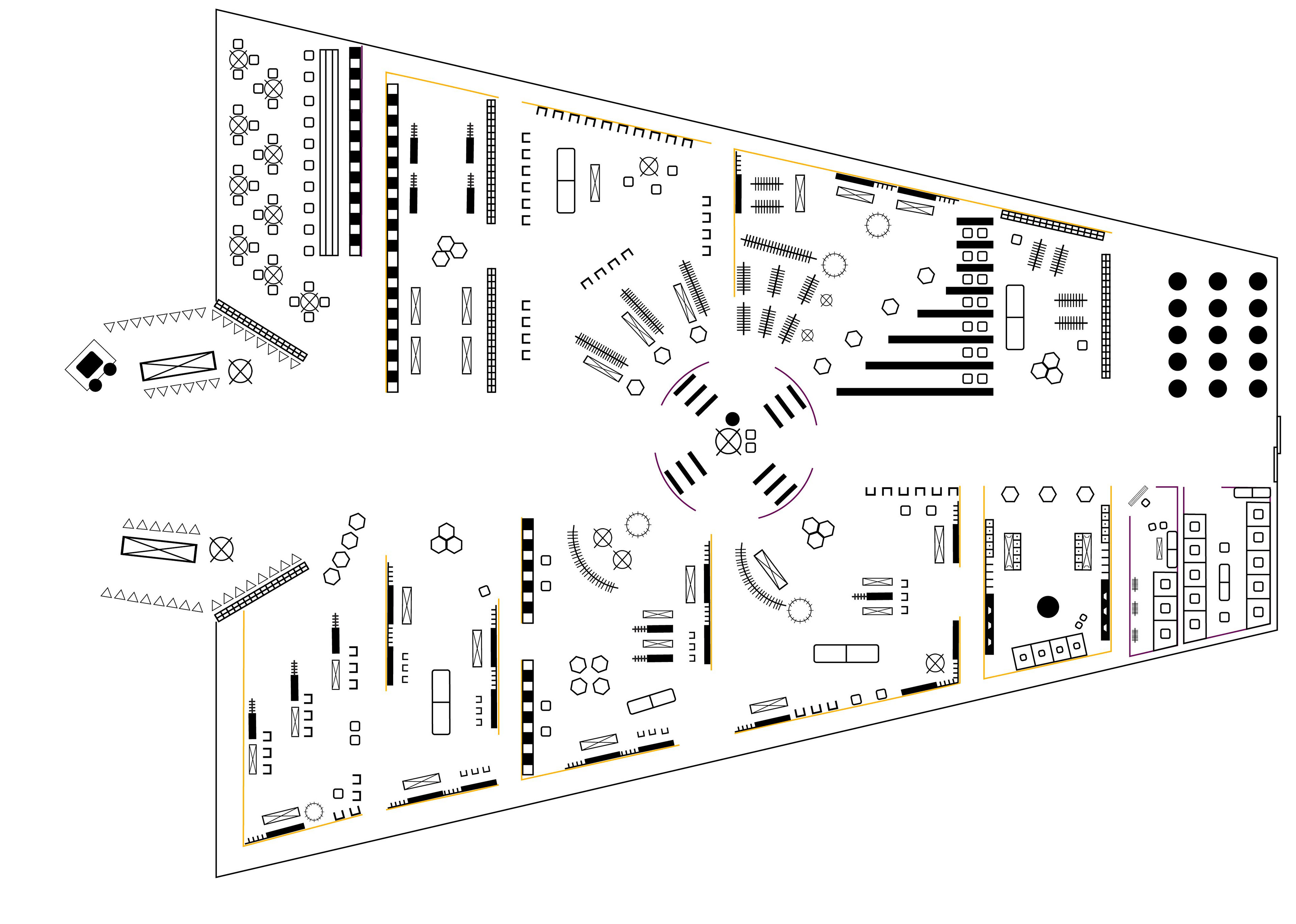
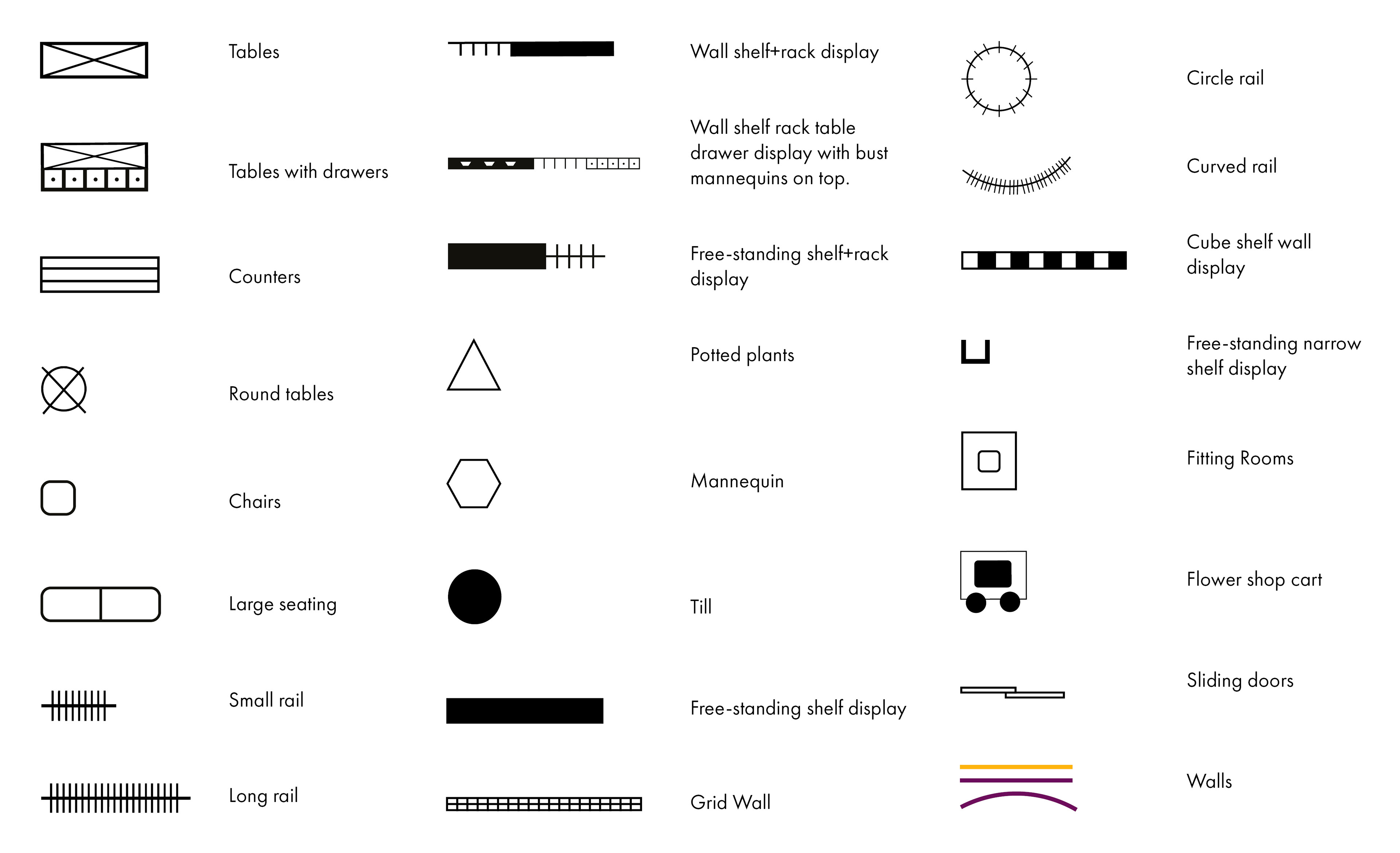
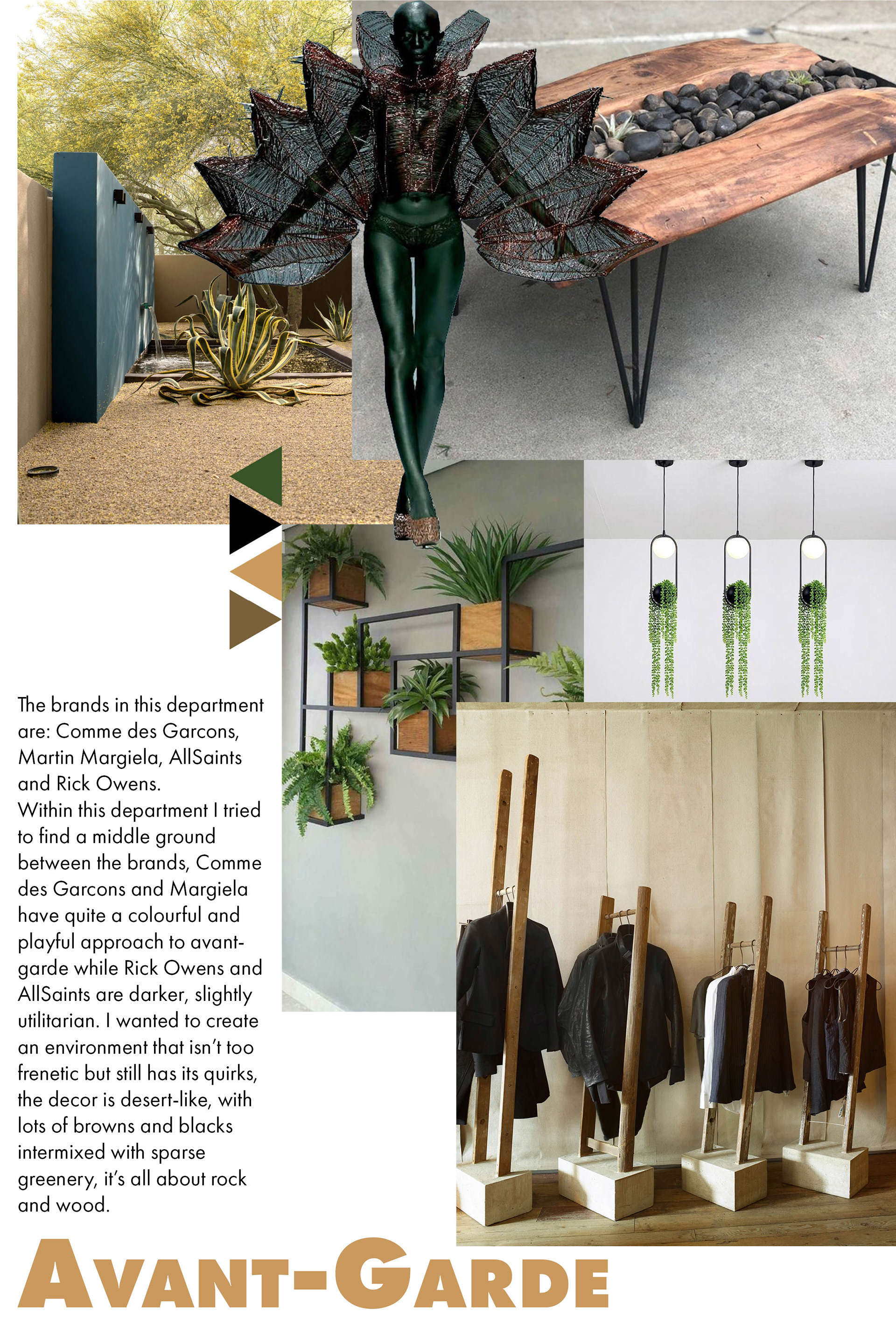
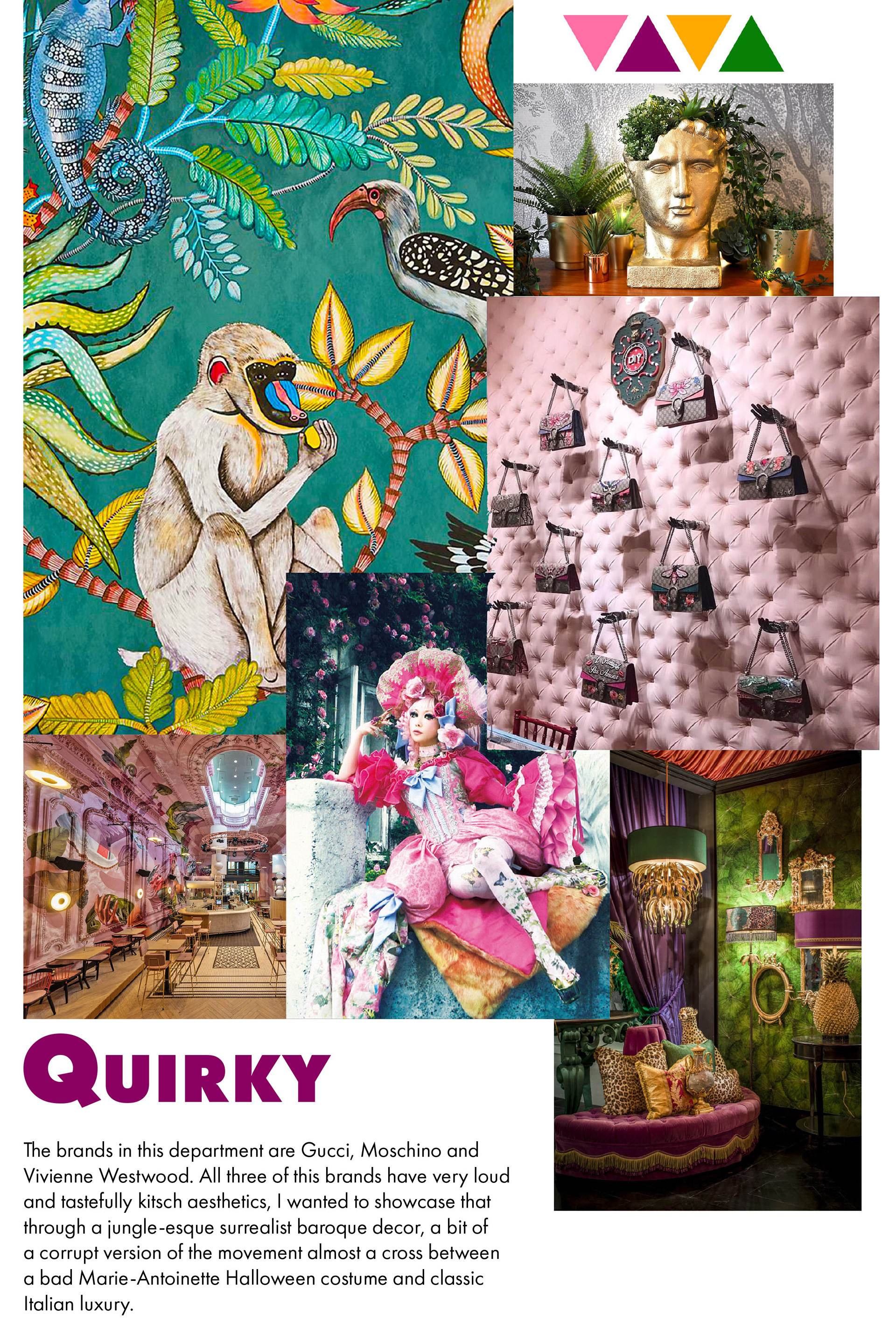
I’ve placed most designer brands towards the front, as I’ve learned that the more interesting/valuable products should be showcased first, preferably to the right, as that’s where costumers often turn to when first entering a store. I also chose to have high-street brands further down because many people may come in for those, so by having them at the back it forces customers to walk through the whole store and they may see something else that catches their eye before getting to their destination.
