The service combines safety aspects, through the implementation of a travel buddy system and a panic button connected to the local authorities, with travel features such as a private guide service, a database of information compiled by locals, image and voice translator and offline maps.
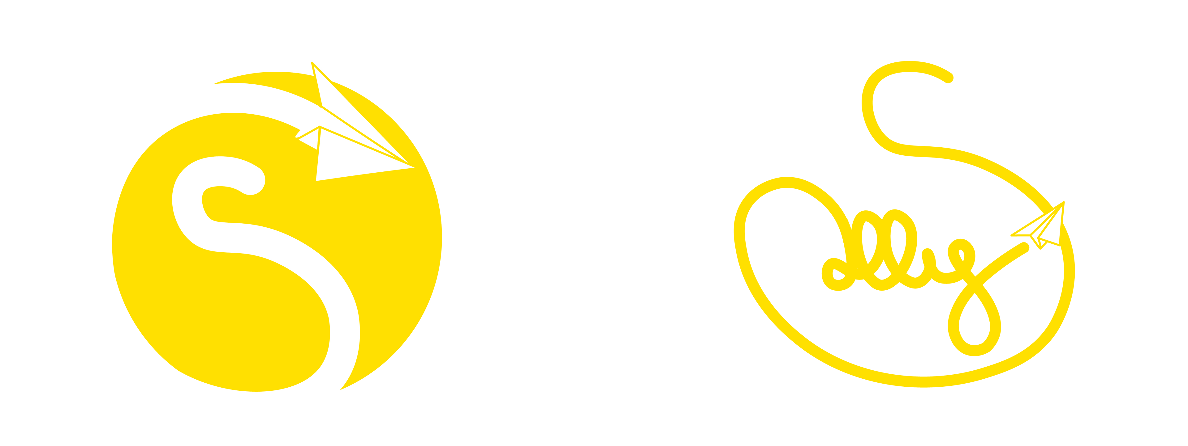
I chose a golden orange for the main brand colour as orange is often associated with adventure, it’s a prominent colour in the travel industry and it’s also used to represent the Sun.
The Sun is a major part of the logo as the concept is for travellers to go towards the sun and follow their dreams of adventure.
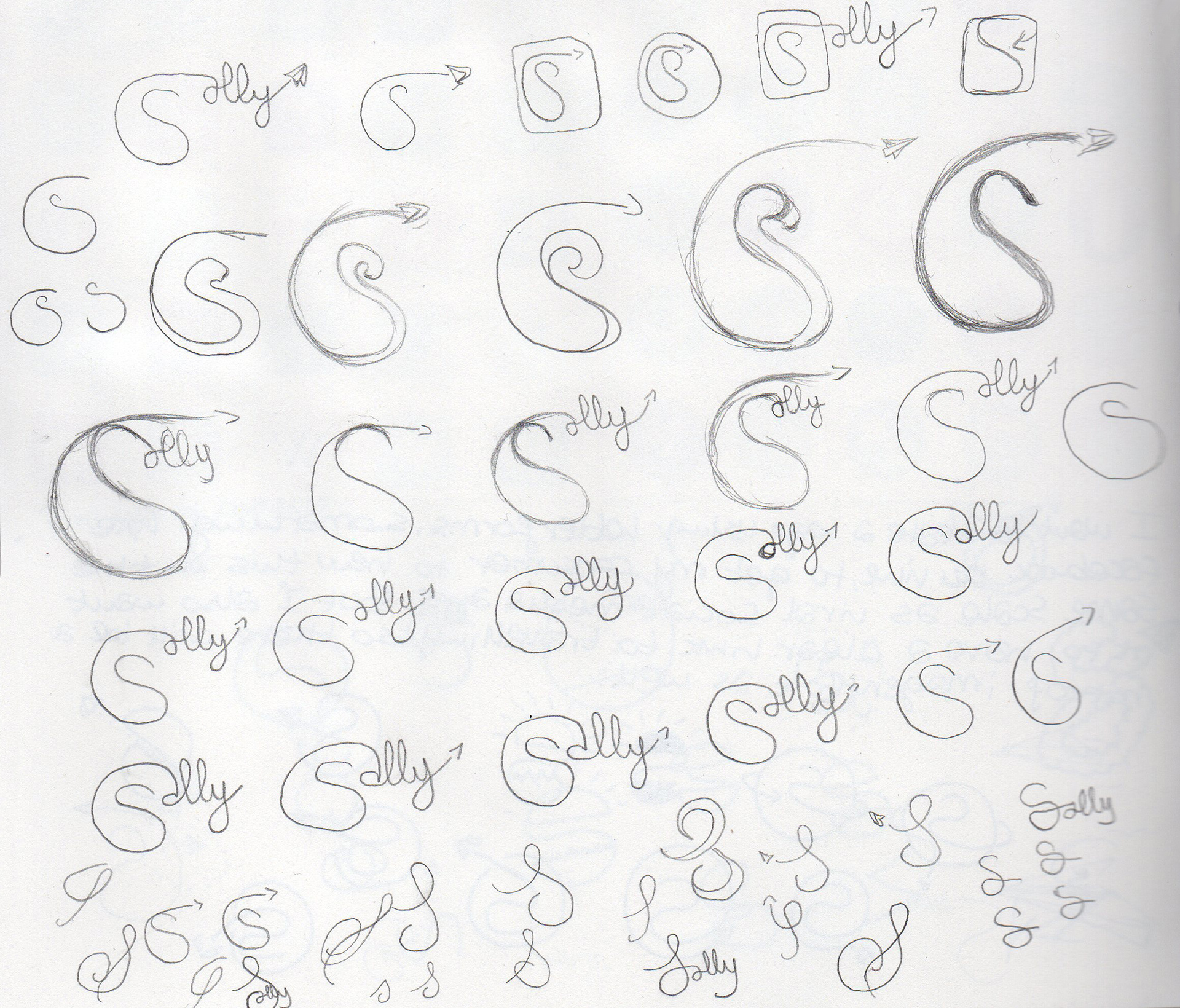
The meaning of Sally is:
A sudden rushing forth or activity.
An excursion or trip, usually off the main course.
An outburst or flight of passion, fancy, etc.
To set out on a side trip or excursion.
To set out briskly or energetically.
I wanted to encompass that in the brand logo, using imagery symbolising flight and freedom, embarking on a journey.
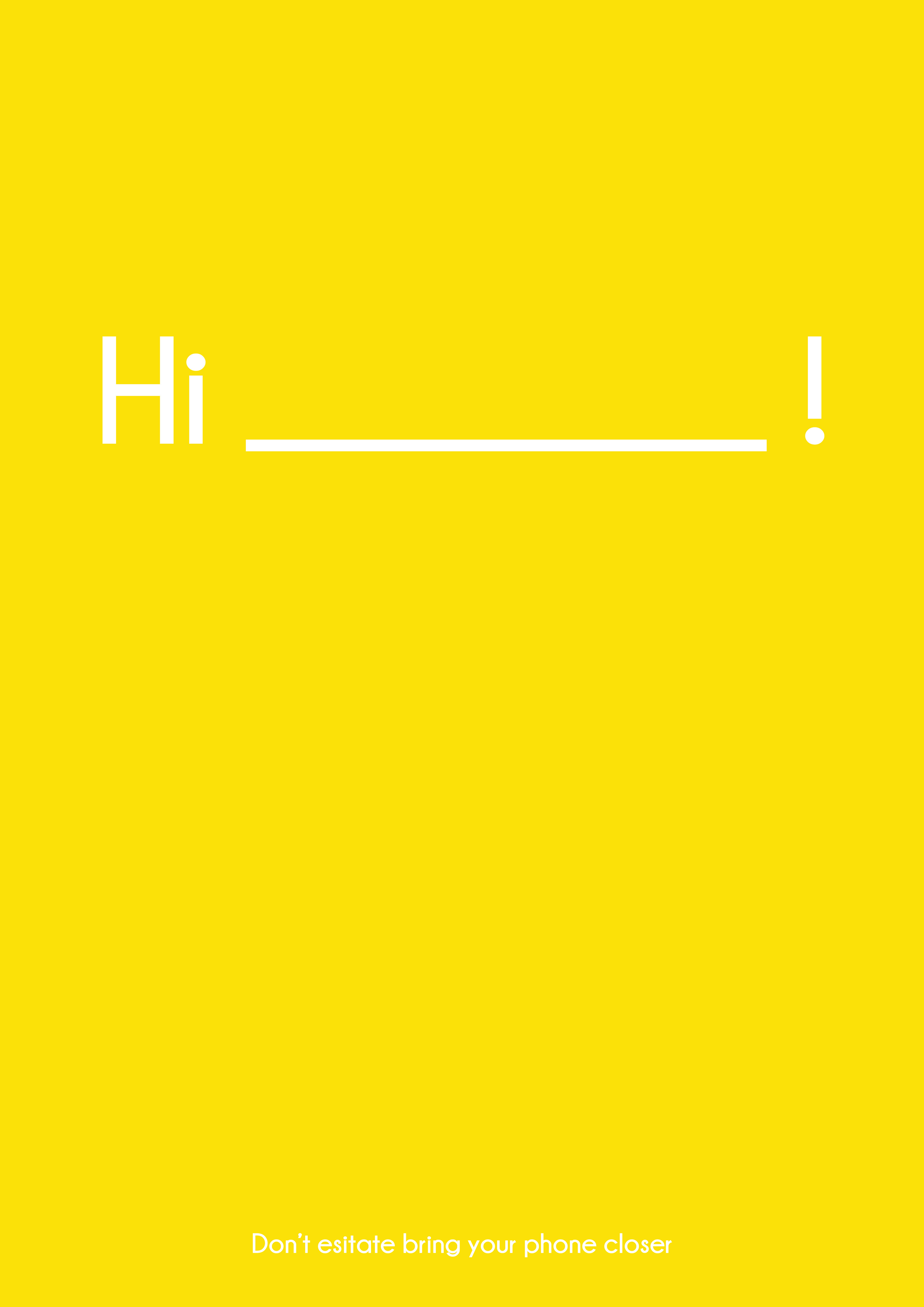
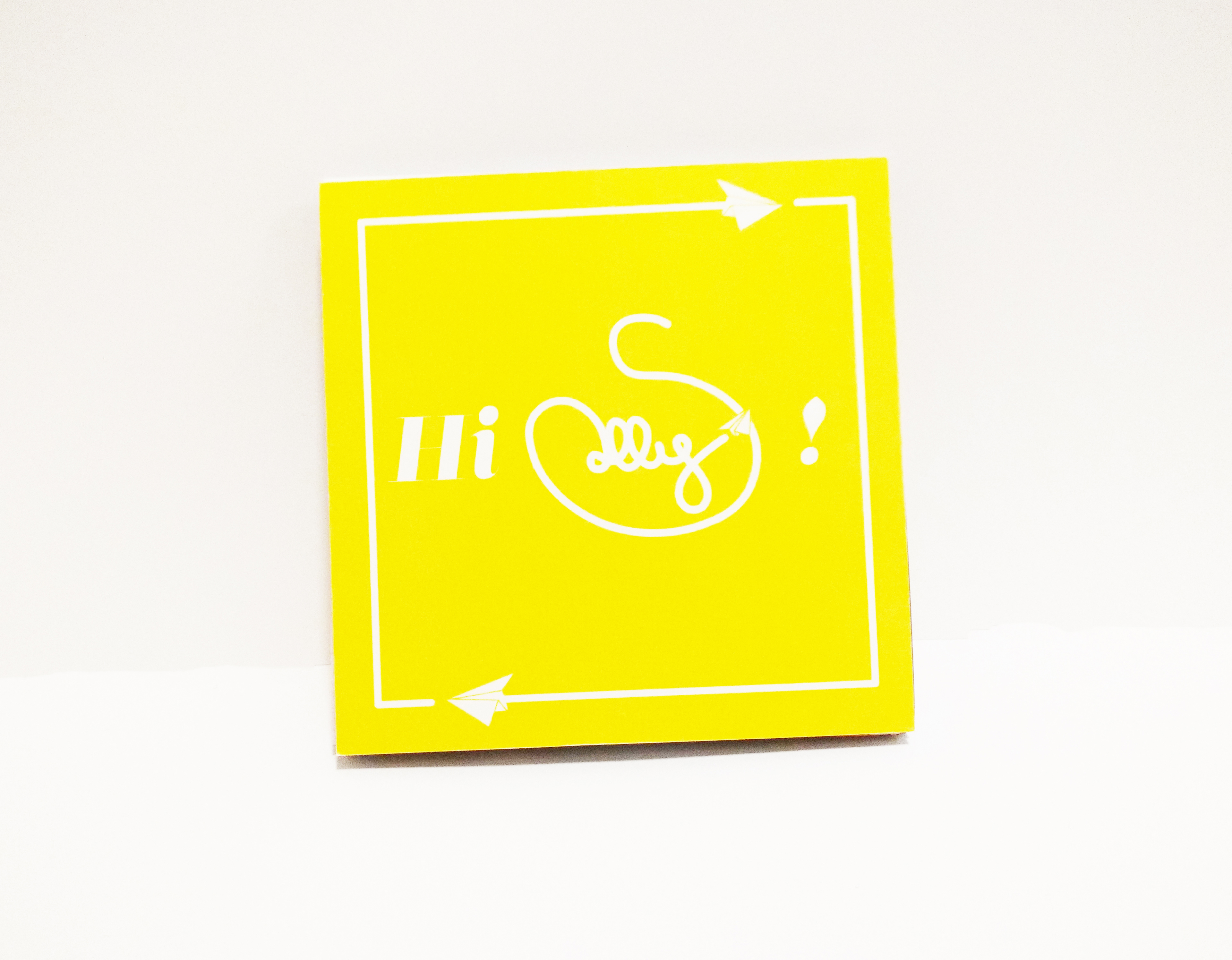
Sally is a common female name, I wanted something that allowed for the users to feel like the service was talking to them and for the brand to also be able to play around with the catchphrase “Hi____!” in their promotional material.
As I had no knowledge of app building at the time and my course was more veered towards graphic design, I decided to present the final outcome as a concertina booklet, showing the mock-ups of the app pages. I added captions and photographs that I had taken during various holidays to give contest to the app pages and for visual aesthetic.

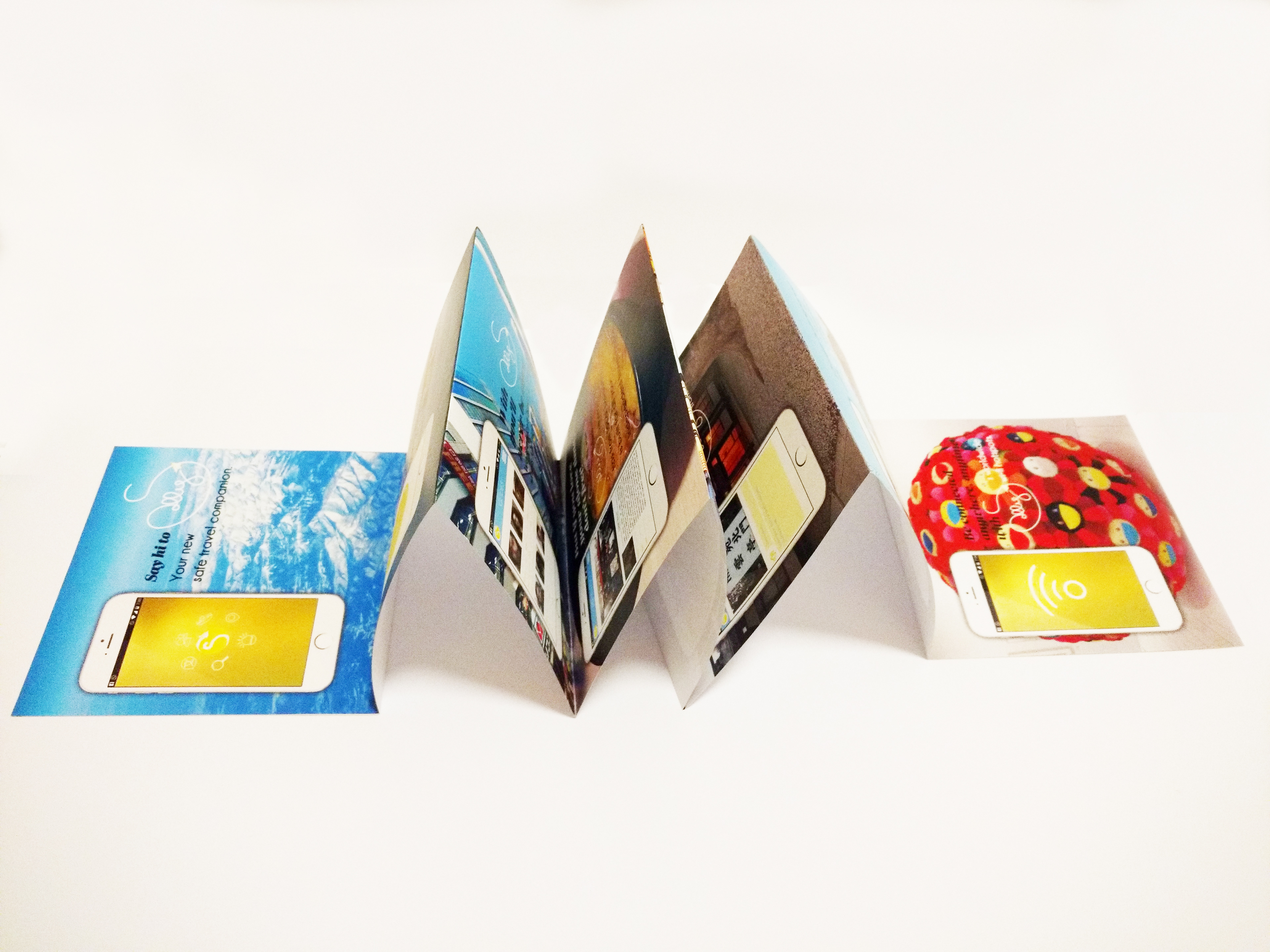

After I had completed the project I got some feedback on the look of the booklet, I was told that the photographs were overpowering the app pages and the text. Following that I decided to tone down the images by putting them in grayscale and adding a layer of white and gold on top of them so that the app pages and the text would pop-out more.