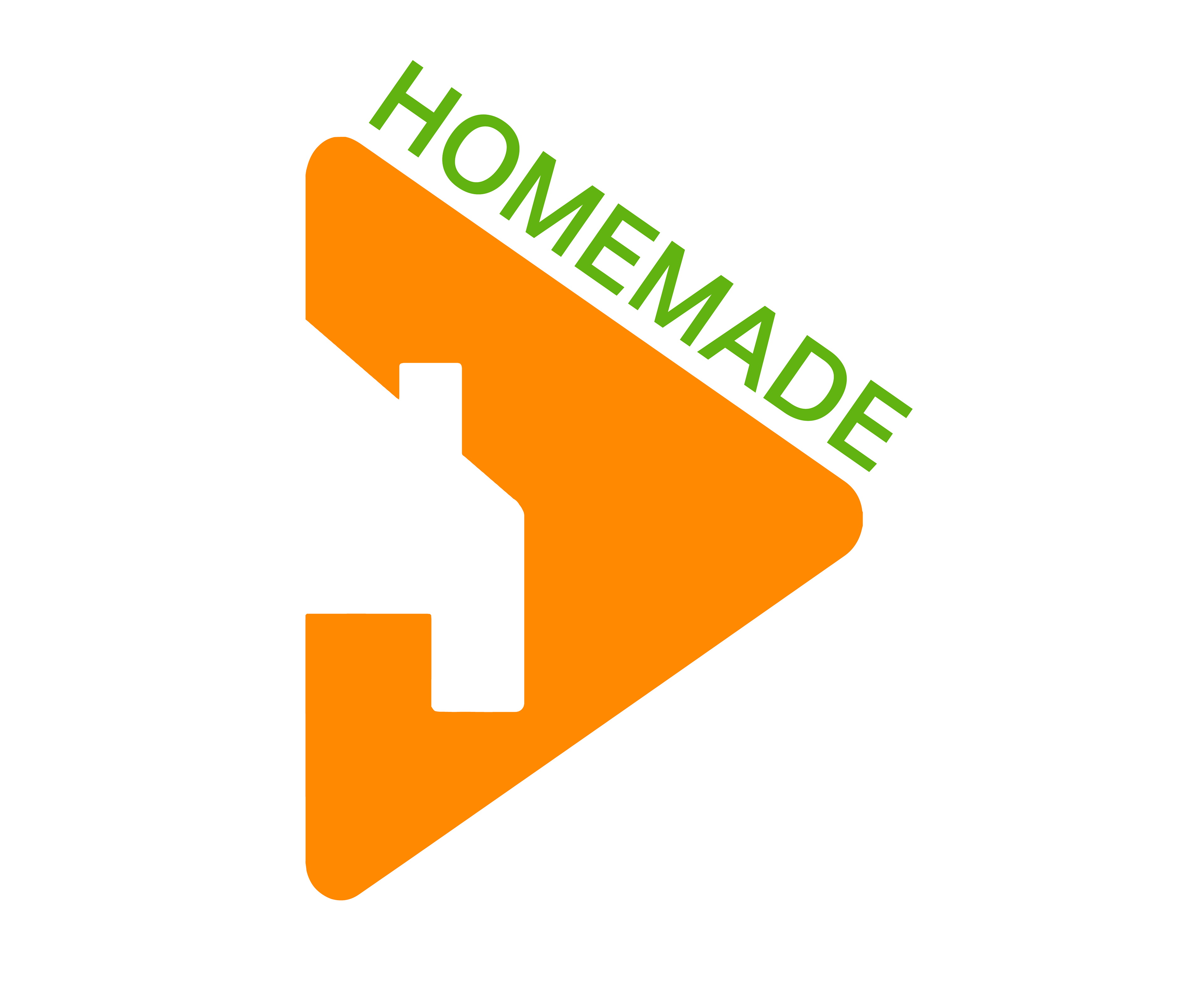
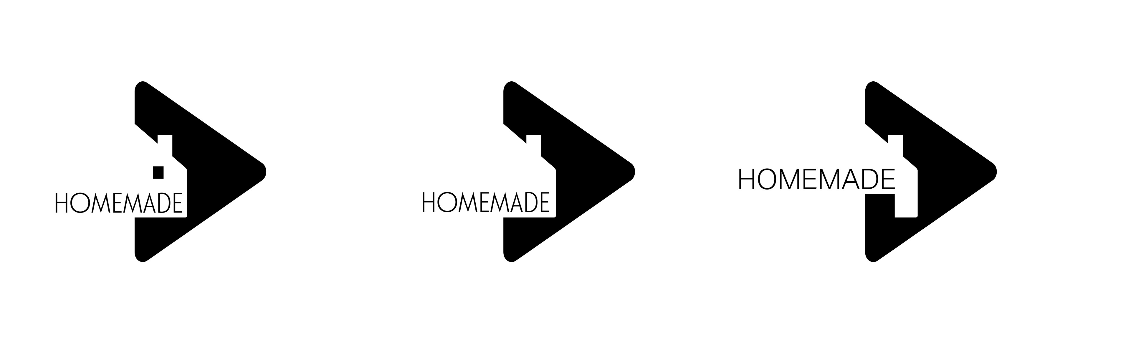
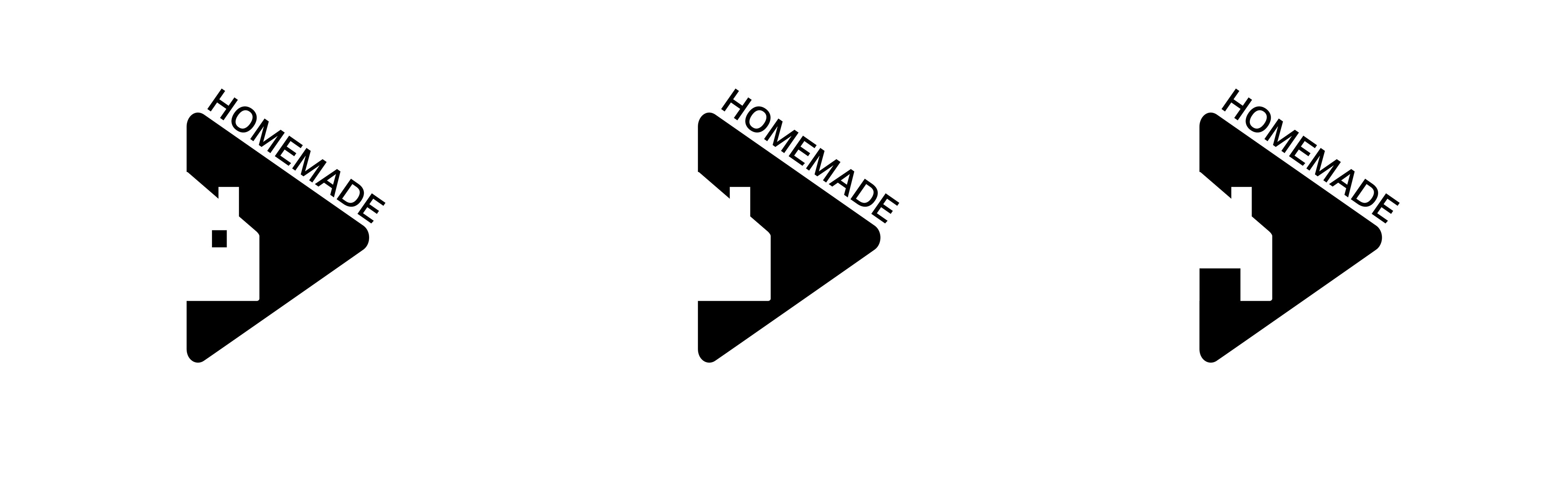
The logo and colour scheme were inspired by the concept of healthy eating, I needed something that sent that message across while also giving people an idea of what the service actually does.
It’s a combination of a carrot, a house and a play button representing the service’s aim of introducing people to healthy eating through homemade video content.
The brand name is also a play on the idea of homemade recipes generally being healthier and home-videos being more genuine than over-produced content.
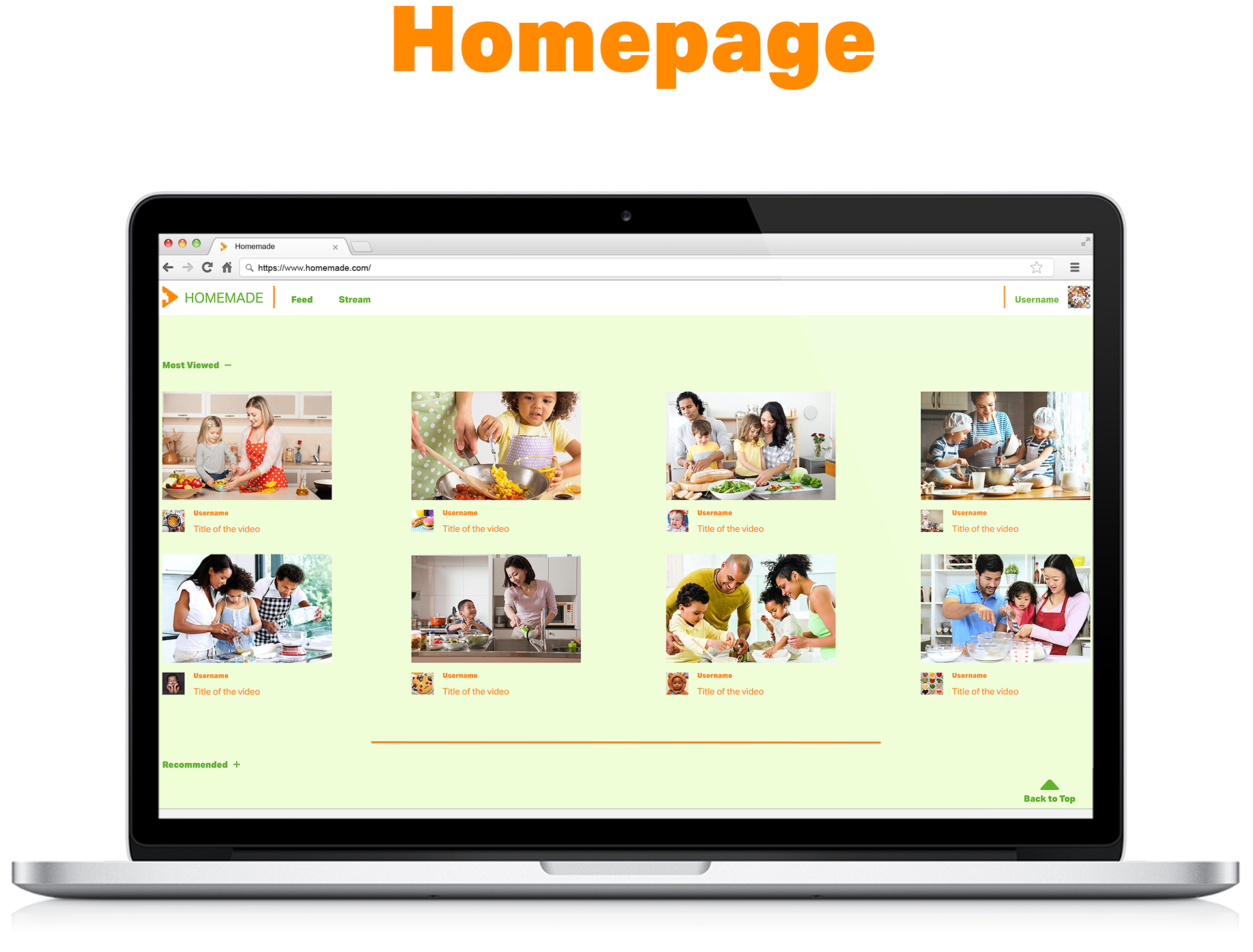
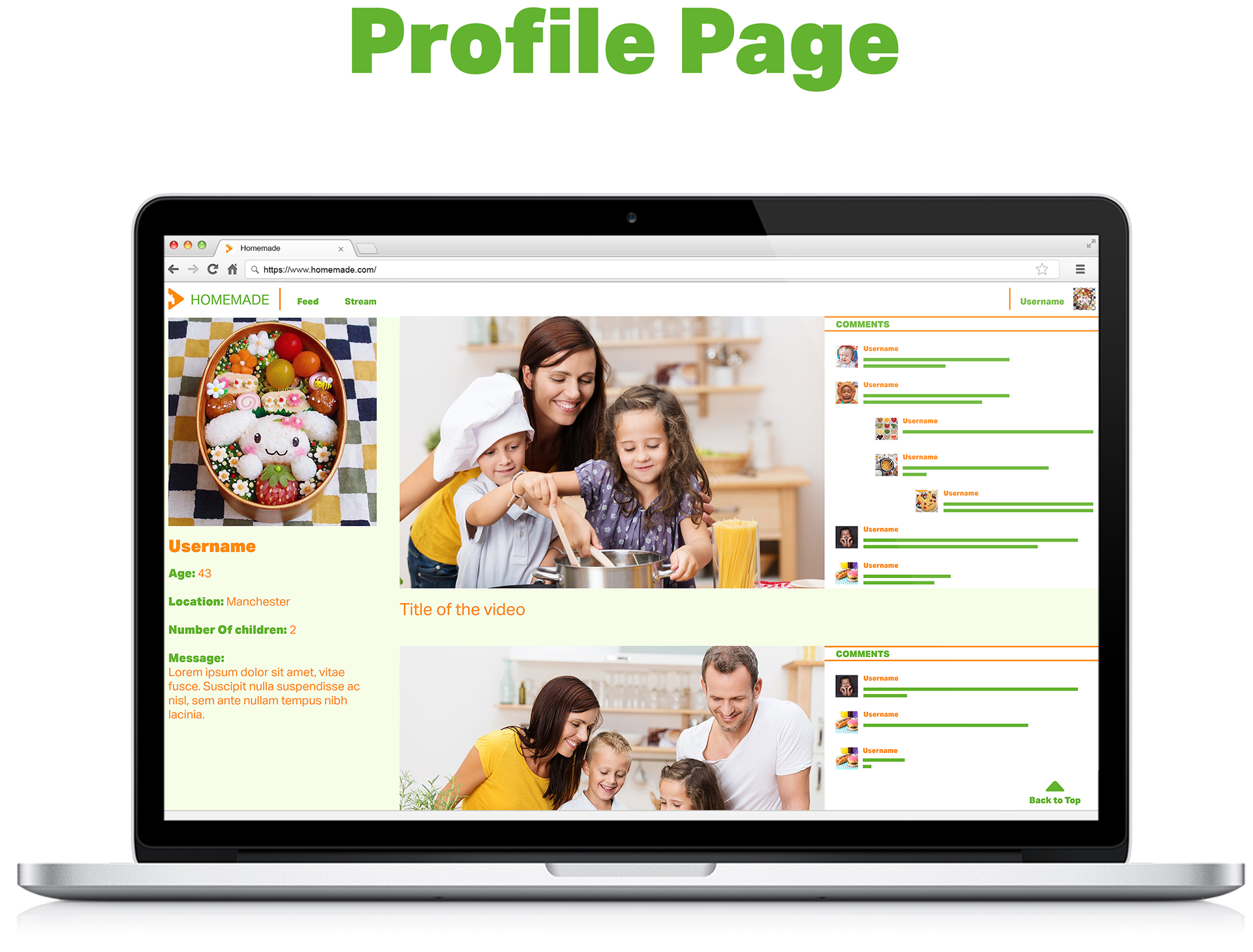
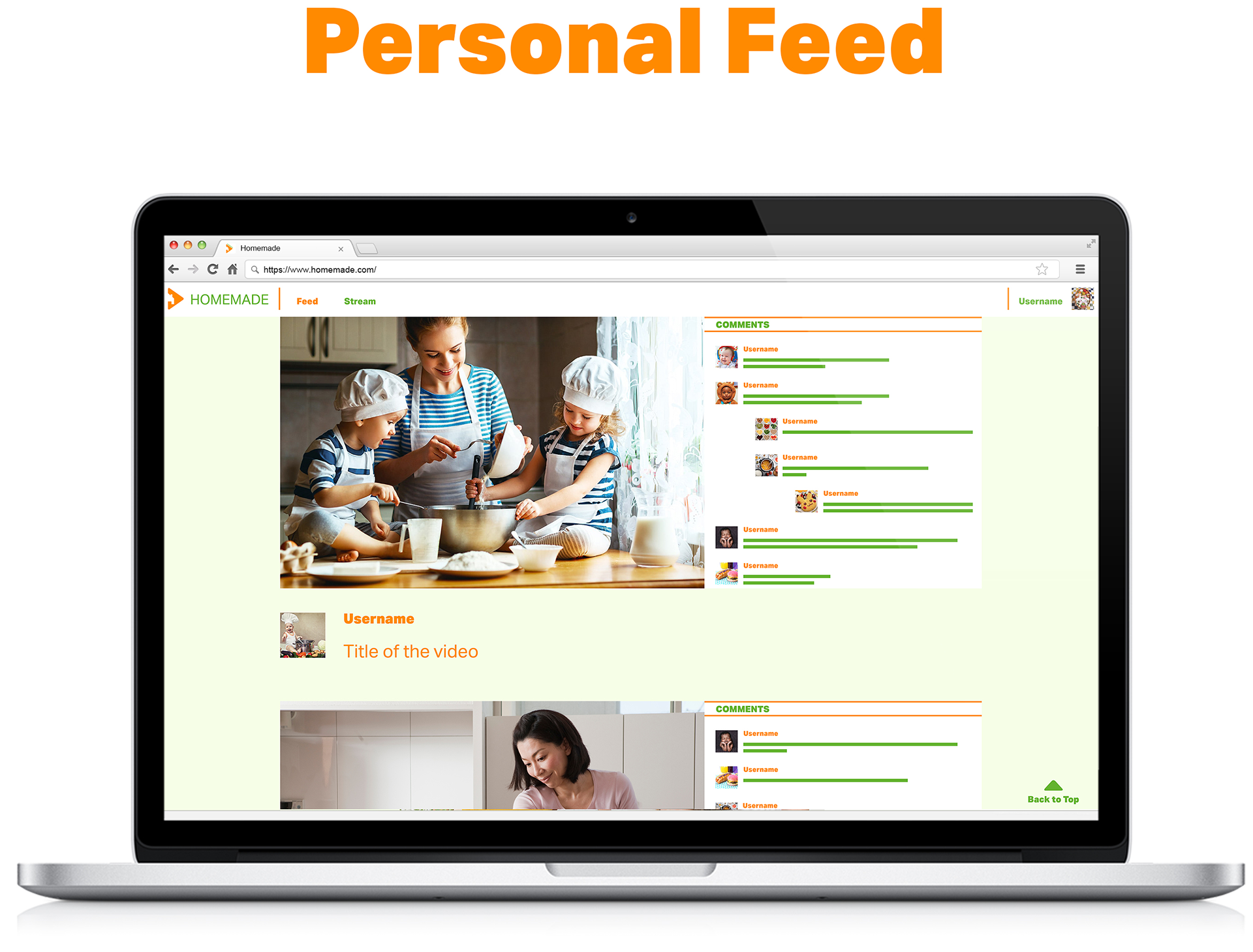
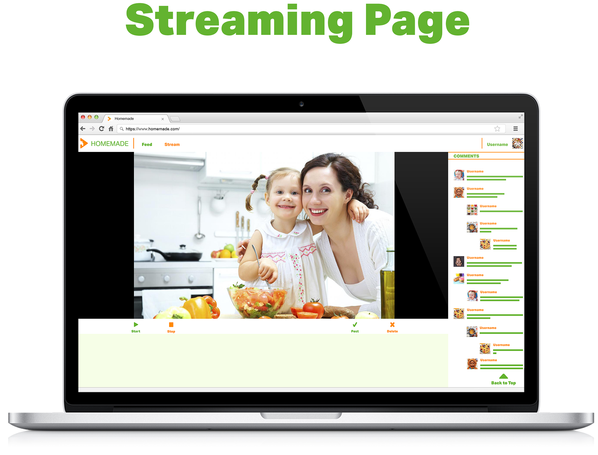
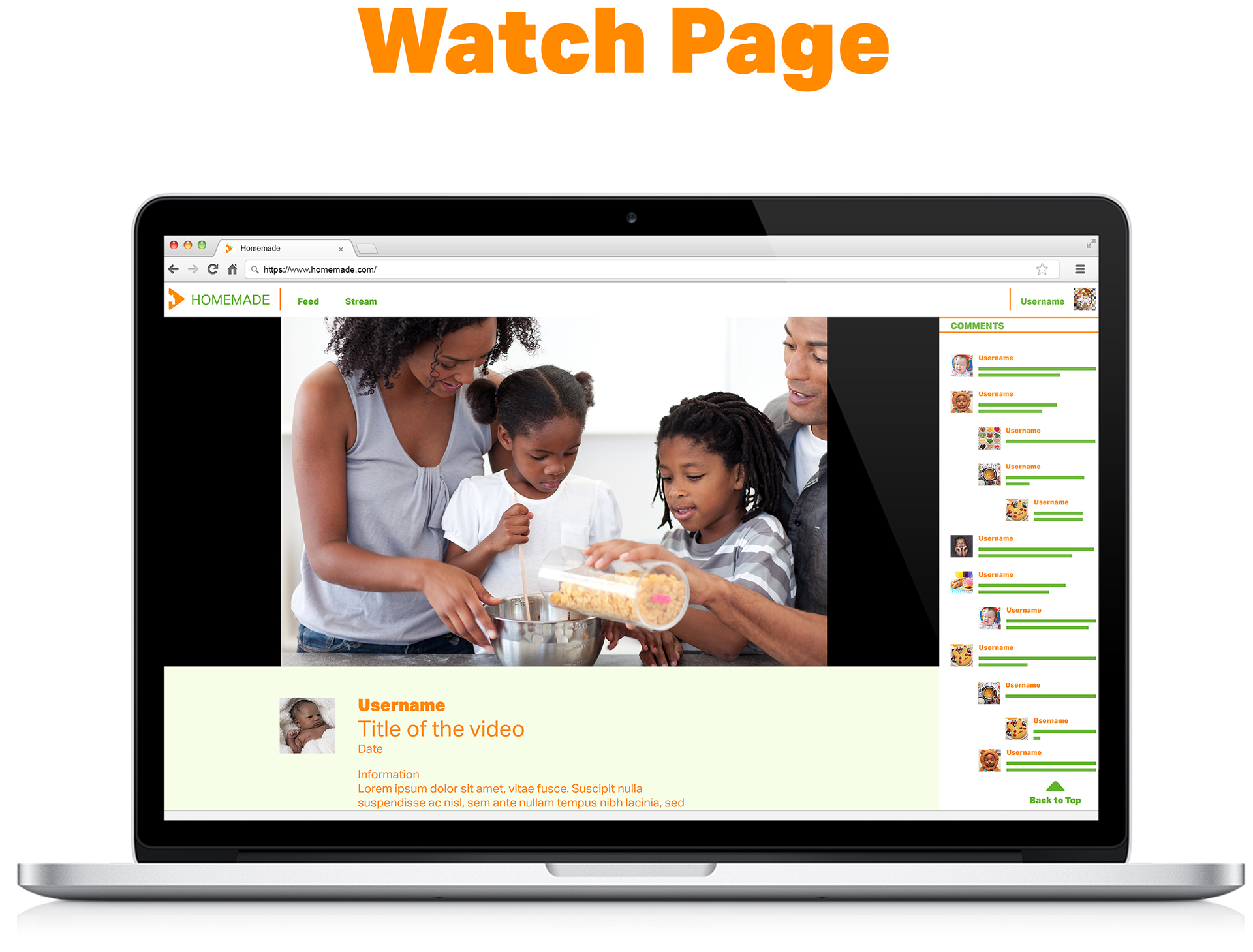
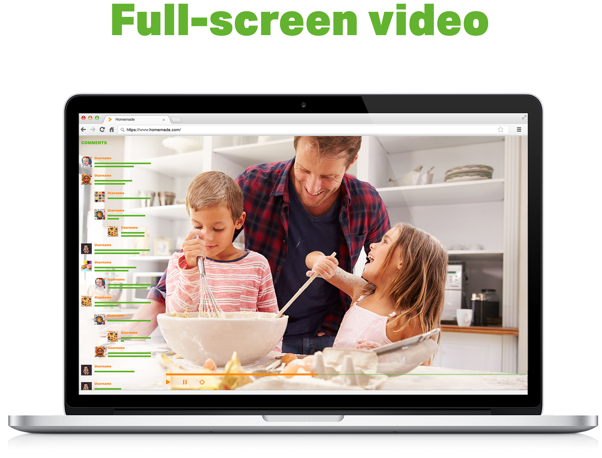
The website was intentionally minimalist, focusing mostly on the video content and viewer comments.
I wanted something that was easy to understand and use for people of all ages, avoiding clutter and letting the users easily take control of the website.