For this group project we were asked create a maquette Christmas window display for a brand of our choice. The brand we chose was Missoni, an Italian fashion house known for their colourful woven chevron patterns.
The main idea behind our window is gifting, Christmas is all about gifts especially in the retail industry. We didn’t want to create something clichéd though, we wanted something a bit more interesting, that made people think harder in order to guess what’s going on.
We started the project by conducting visual research on Christmas window displays, wanting to gather as much information as possible in order to have a greater insight into the role of visual merchandising during such a crucial time for retail.
Many brands have created window displays using the items they sell, we really liked the idea of creating something out of something else, it gives the whole display a quirky twist.
Gathering the images we found together has also helped us to pinpoint the brand that we wanted to work on for our task. We chose to create a display for Missoni as we were quite impressed by their 2012 Christmas window for Harrods. We tried to look for more examples of their Christmas displays but we could not find much, which cemented Missoni as a brand we had to work on: We felt that creating a Christmas display for a brand that barely had any would be the perfect challenge.
Missoni is widely known for their chevron pattern that features on everything from dresses, to hand towels, pillows and mugs, it is effectively their signature and one of the most recognisable patterns in fashion. We wanted to make use of that and apply it to our window as the identifier for the chosen brand, alongside the more obvious brand name.

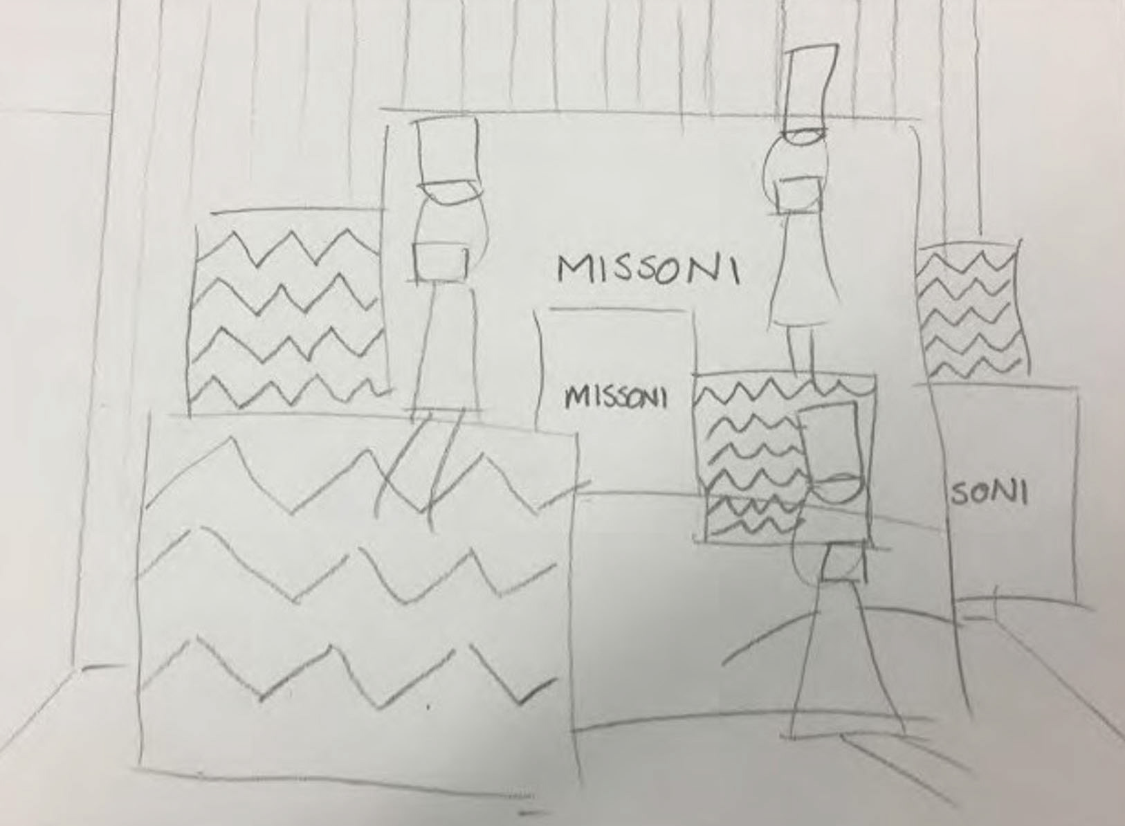
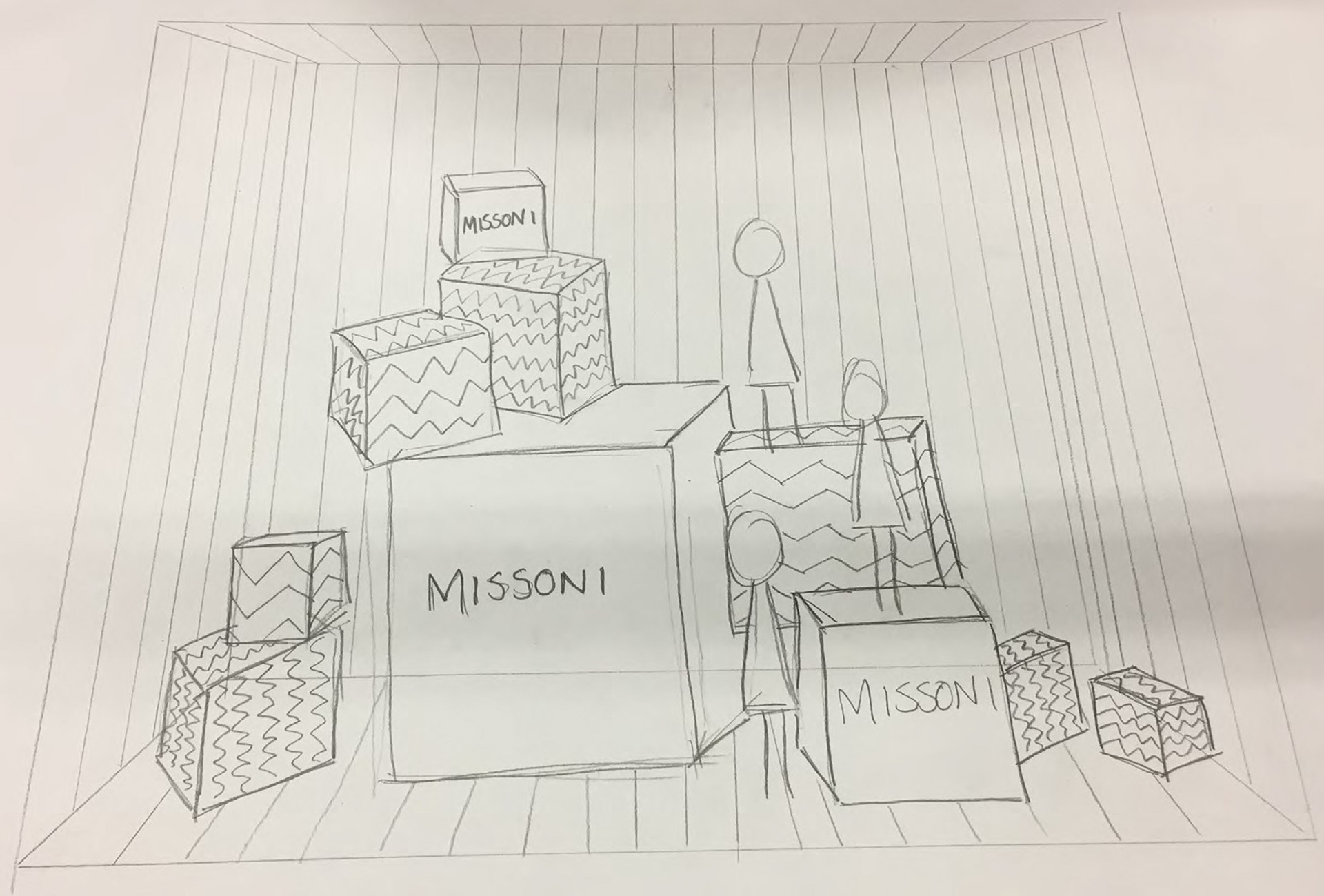
We were really taken by the idea of gifting as it is a very global concept, even in nations where Christmas has no religious connotations and isn’t a big deal people still like to exchange gifts. The consumerist aspect of Christmas has taken over the whole world and we thought a global retail brand like Missoni could capitalise on that within their display. We sketched up some initial ideas for the window and as we went along the concept started to slowly come alive, adding more and more details that allowed us to better visualise what we could do for the window.
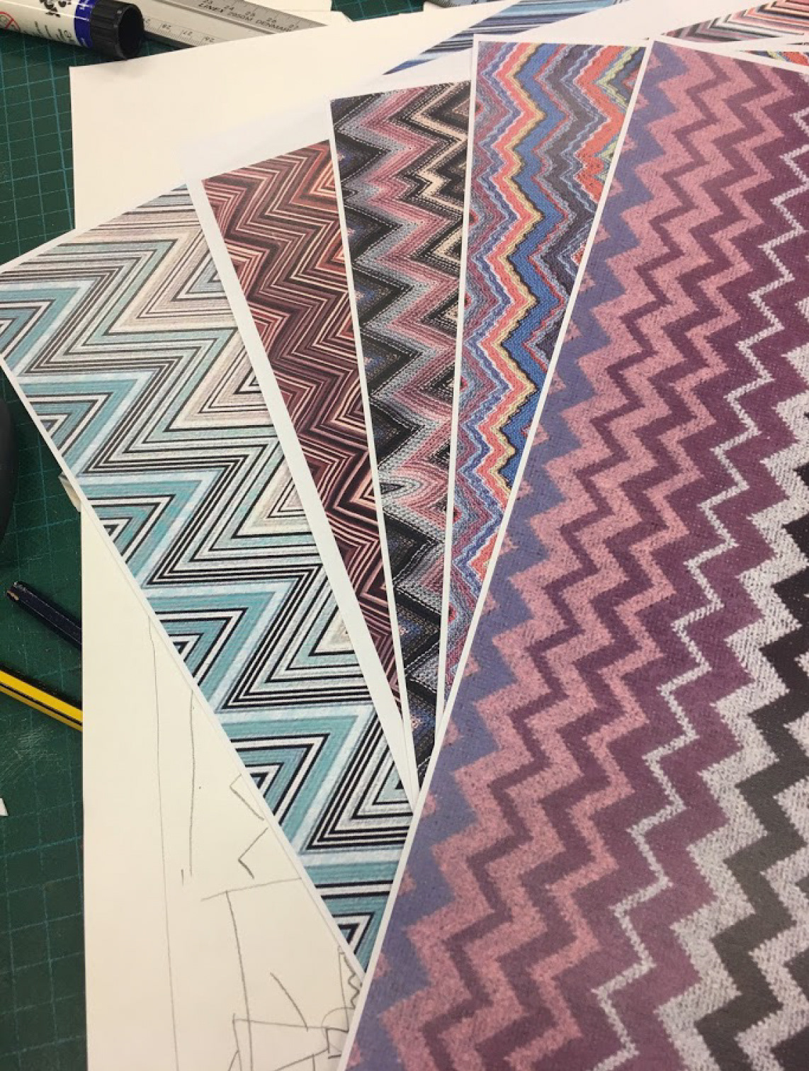


We created boxes in a variety of sizes using different Missoni chevron prints and the colour orange which, like the chevron, features heavily in Missoni's branding. We also decided to add black and white stripes in the background of the window to create an interesting optical illusion that would stop the window from being overwhelmingly colourful.


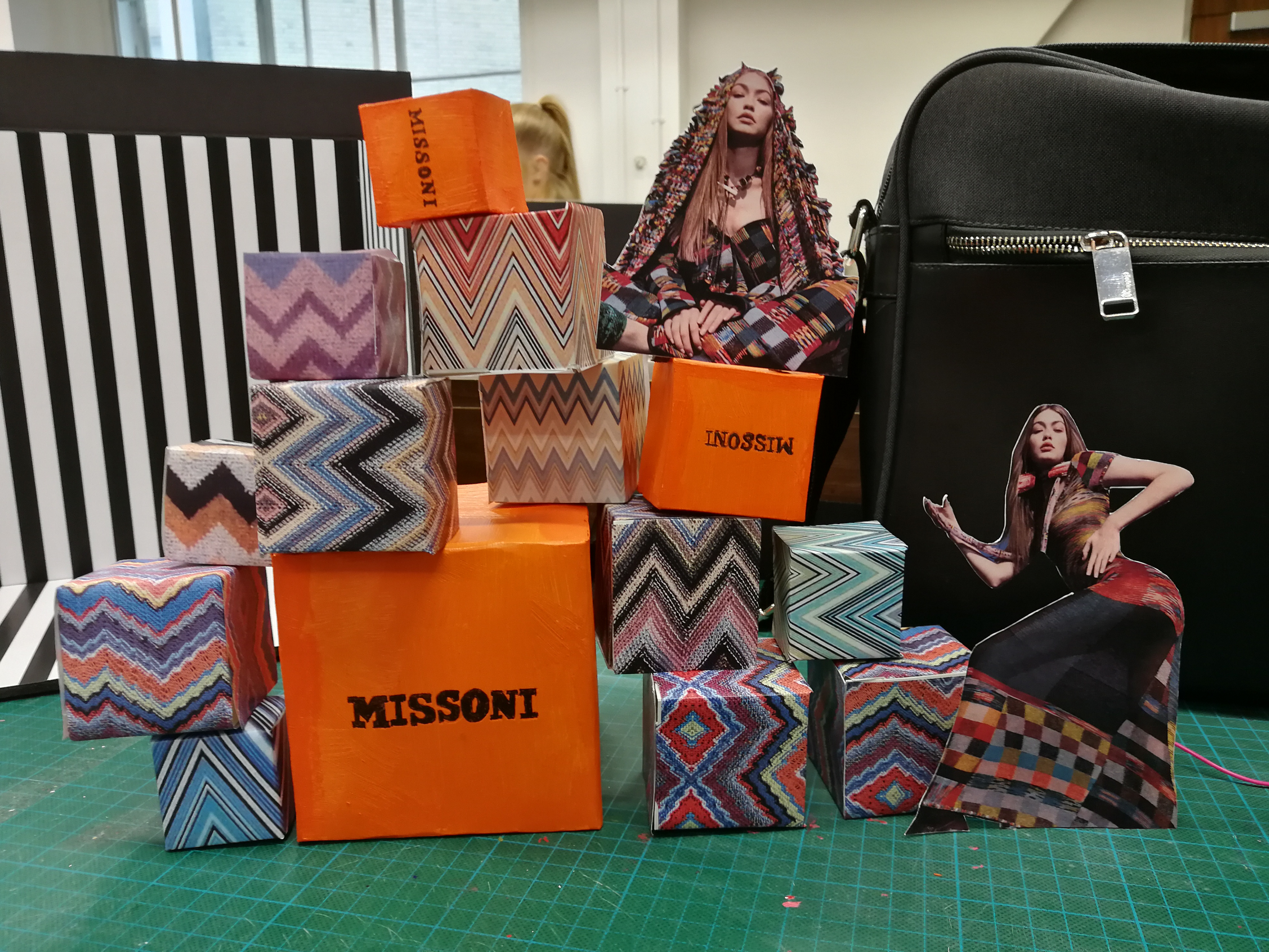
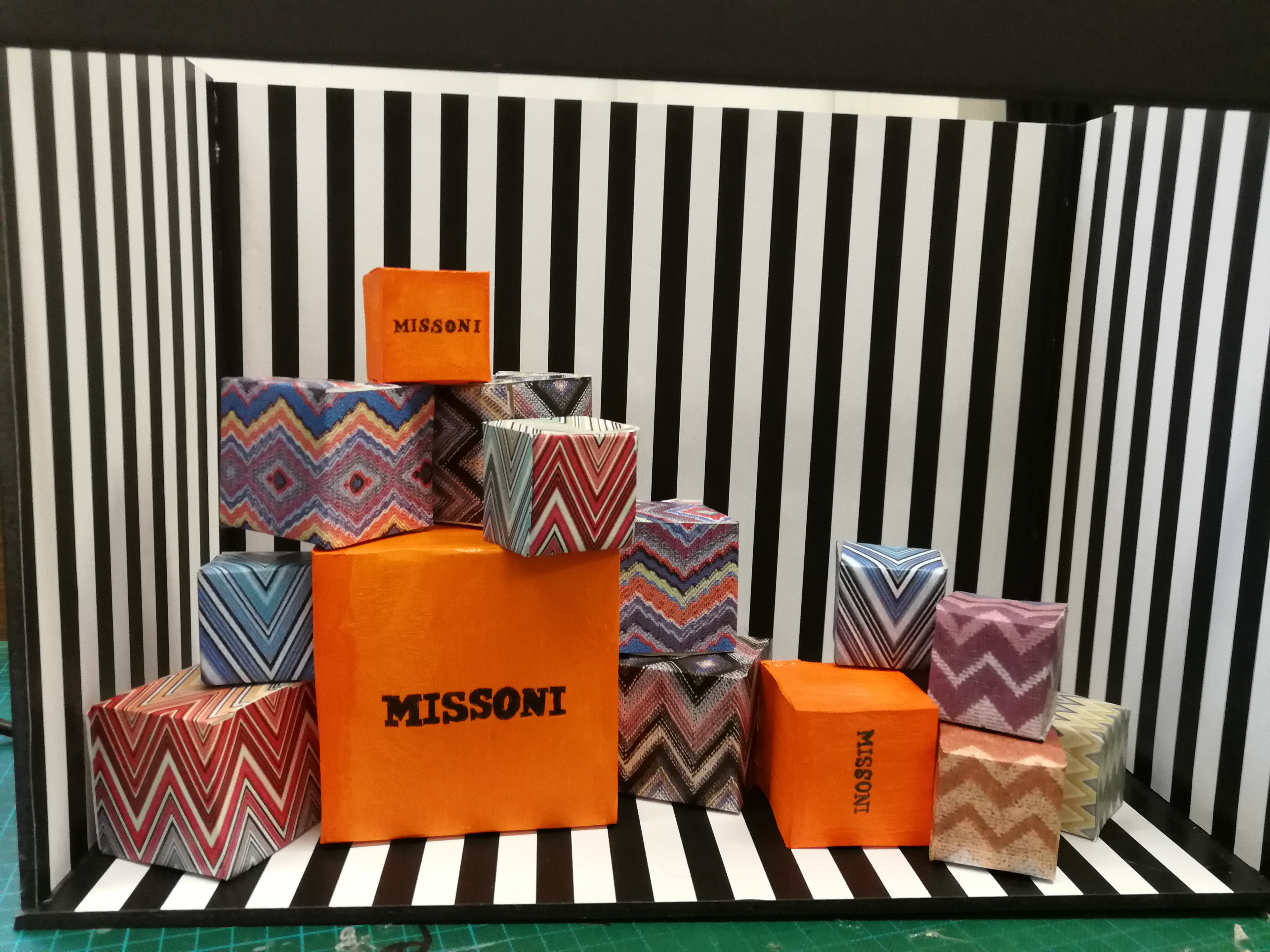
After we created all the props for the window, we started thinking of ways to lay everything out. We tried various placements for the boxes, looking at what would be visually pleasing and physically possible.
A vertical placement was an initial option, but we agreed that it would be best to make full use of the available window space, prompting us to create more boxes to fill up the area. As we added them together we started to experiment more with depth and perspectives. We didn’t want the window to feel flat, so we played around, tweaked the boxes slightly to the left or to the right, pushed them backwards and forwards, until we finally reached what we felt was the perfect layout for the window.
A vertical placement was an initial option, but we agreed that it would be best to make full use of the available window space, prompting us to create more boxes to fill up the area. As we added them together we started to experiment more with depth and perspectives. We didn’t want the window to feel flat, so we played around, tweaked the boxes slightly to the left or to the right, pushed them backwards and forwards, until we finally reached what we felt was the perfect layout for the window.


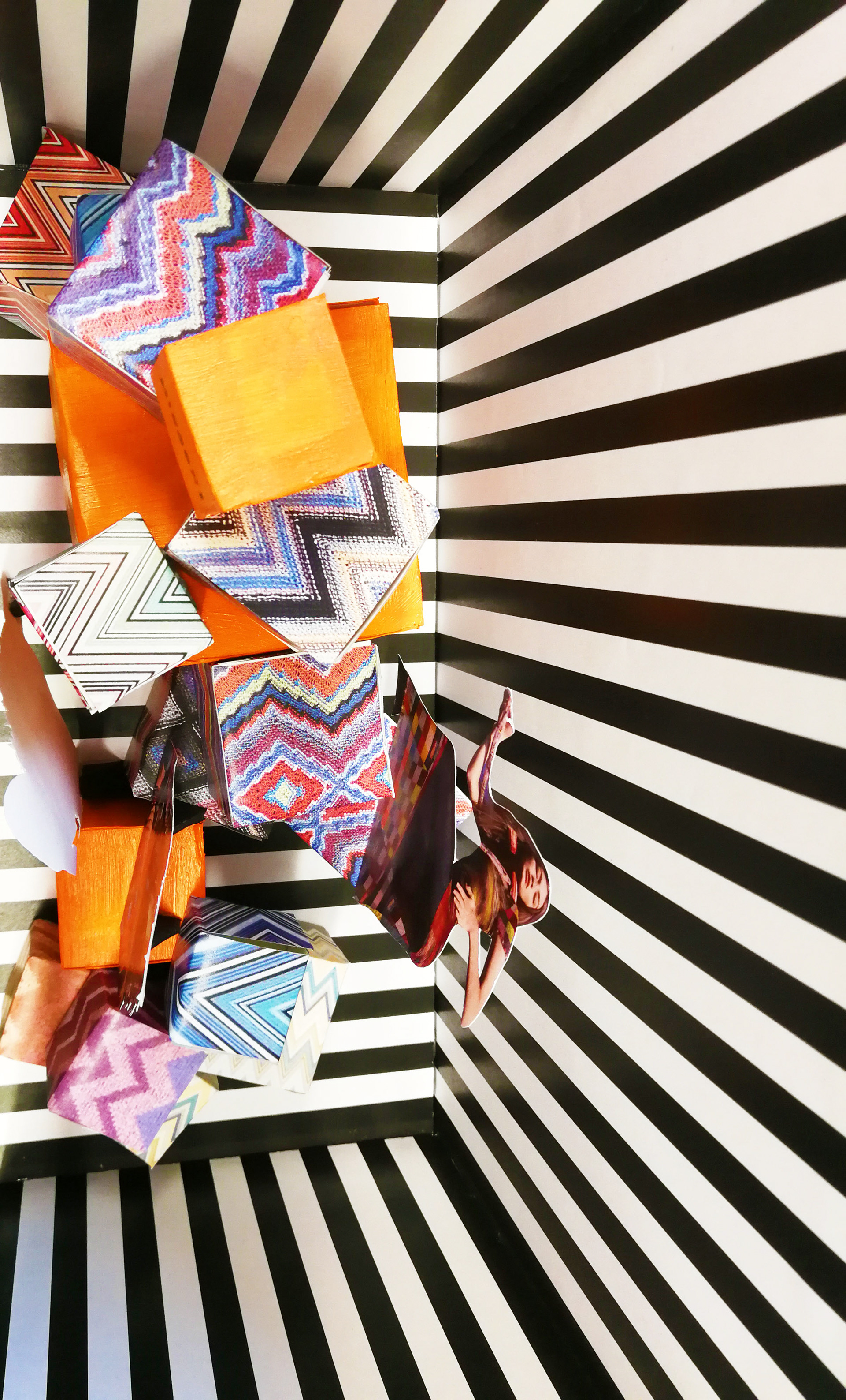
For the final concept we kept things very simple, only using the patterns akin to wrapping paper on gift boxes, we chose not to add bows or other items that normally go with gifts as we didn’t want to risk walking into the territory of a traditional Christmas display. We wanted something, bold, bright but not too stereotypical, we kept it chic and conceptual as we believe a brand like Missoni would.
