A project in which I had to choose a struggling retailer and bring them back on their feet through a brand new business and marketing strategy. The brand I chose is Autonomy, a British retailer focused on timeless, feminine smart and casual day wear wich has recently gone under administration.
For the project I wanted to overhaul the image of Autonomy, give it a fresher, younger, modern feel through a complete rebrand and change of direction for the business.
Click here for the research behind the work.

Autonomy was rebranded as a clothing rental subscription service offering pre-loved luxury officewear from hundreds of designers. I wanted something simple, clean and sophisticated that would fit with its new concept and the logo trends within the fashion industry at large.

One of the aims for Autonomy was to lower and narrow the demographic going for 30-45 year old professional, sophisticated modern city woman, who enjoy the finer things in life in between pursuing their dream careers, offering items that keep up with the changing styles while being timeless and durable.
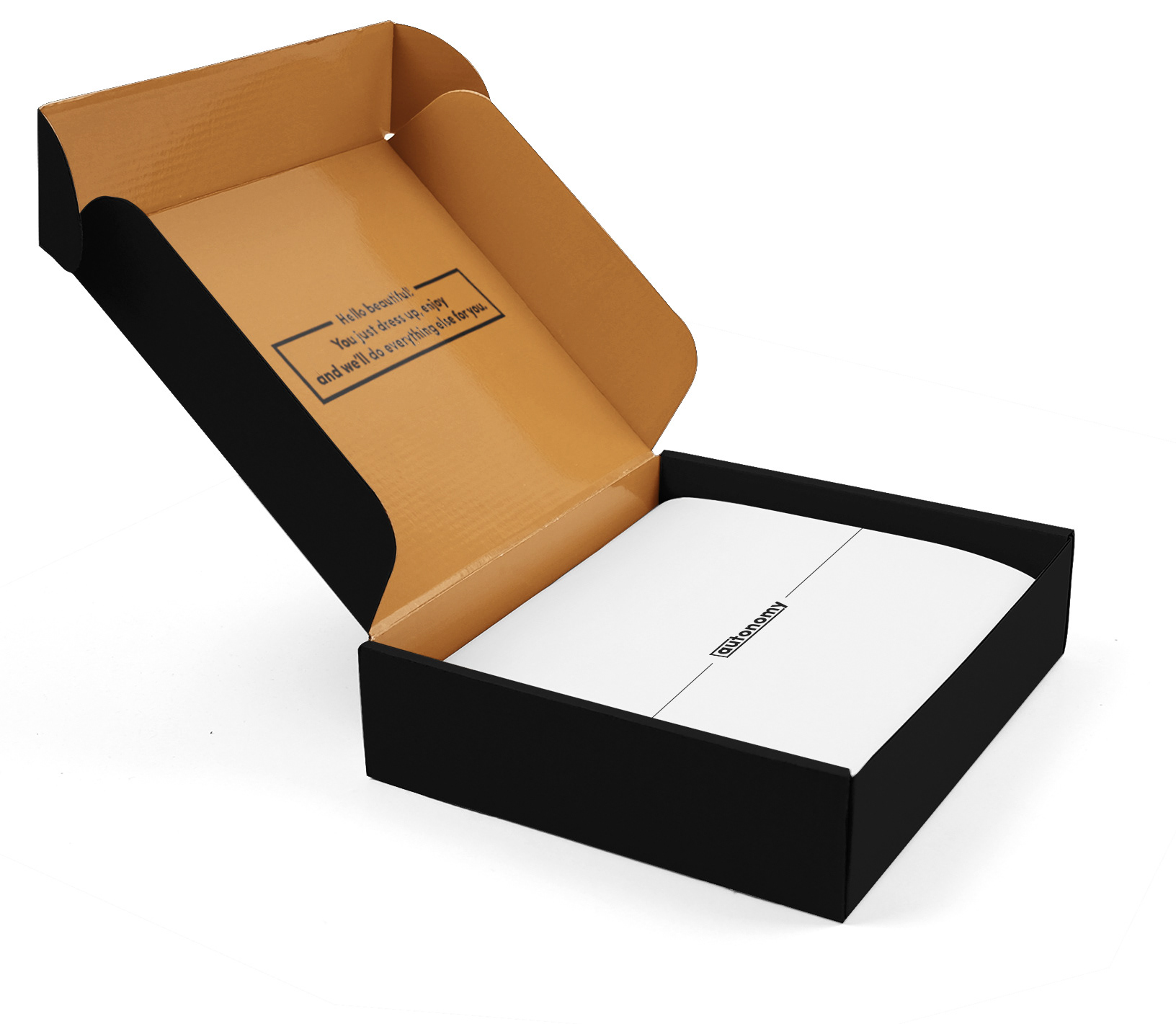
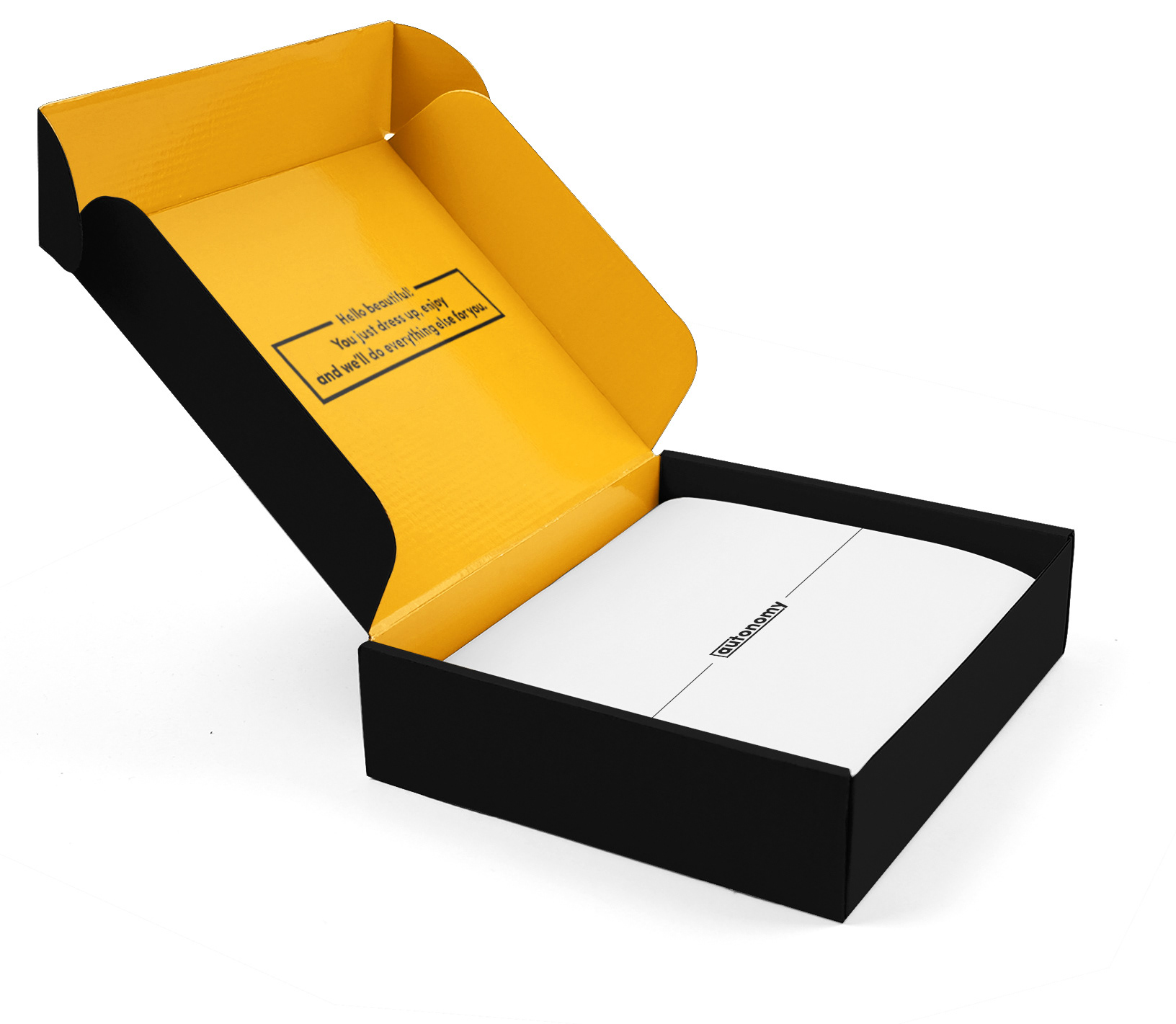
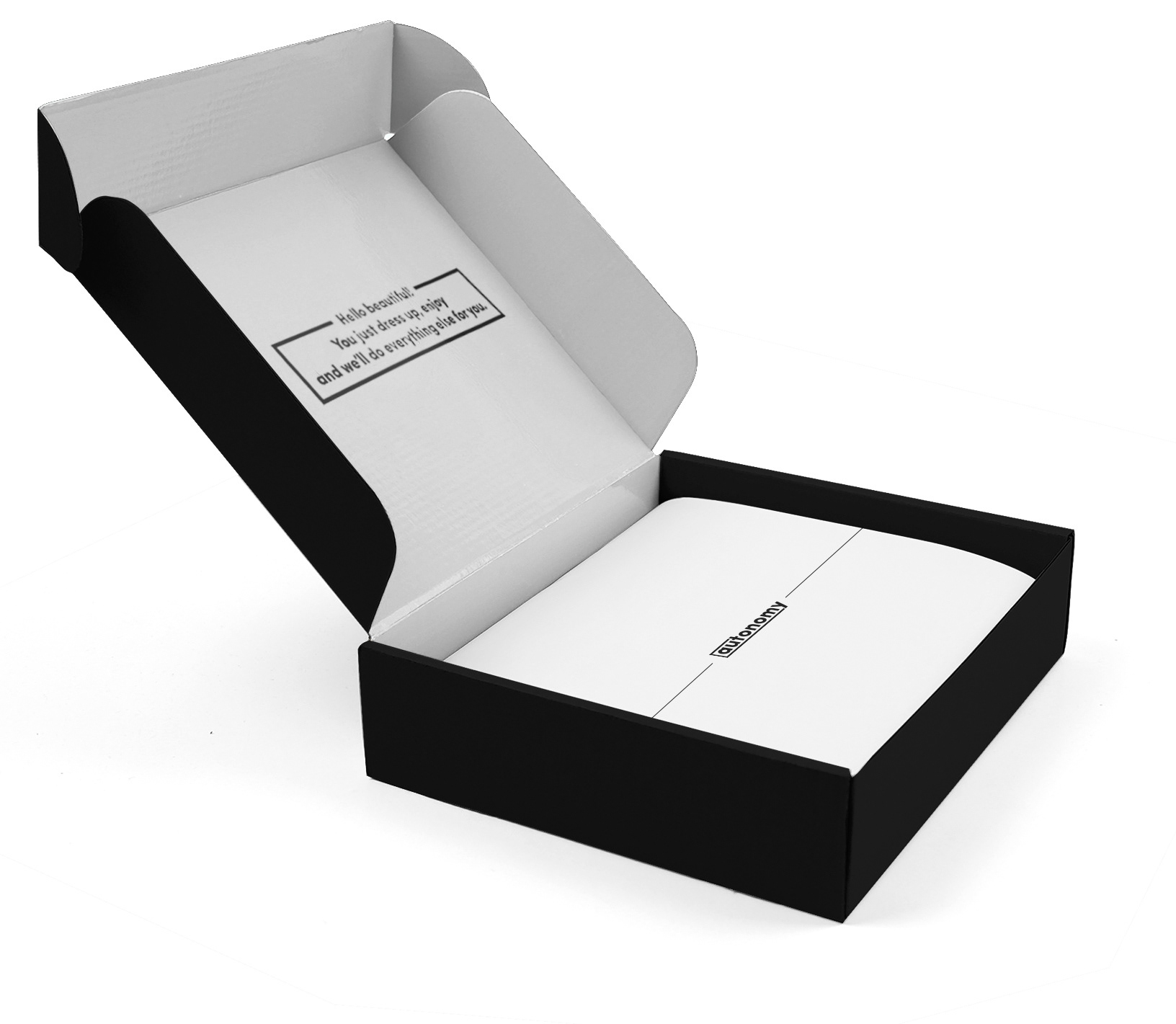
As it's a rental subscription service I focused on creating the packaging, I wanted it to be as simple as the branding, so I kept it black and white with the logo and icon joined up in a geometric design. The interior is the only section with colour; there are three of them based on the three tiers of the service membership (gold, silver and bronze).

I also mocked-up the delivery bag that would be used to store the boxes when sent out, I wanted something that looked quite casual and wouldn't stand out when costumers walked to the post office with their returns.
Back to Top